If you don’t make a good first impression, your children's book manuscript will likely get sent right back to you accompanied by one of those dreaded rejection letters. Editors see a gazillion manuscripts every day, and the sight of certain common errors makes them sigh with impatience. With so many resources available to writers of children’s books, it seems crazy to submit anything other than a clean and well-edited manuscript.
Although all publishers and agents have submission guidelines, some more detailed and specific than others, there is generally accepted formatting that is expected.
Some additional tricks to impressing editors? You may think it goes without saying, but you’d be surprised: Never send something that shows the signs of an argument you had — and lost — with your printer’s ink cartridge. And for goodness' sake, don’t forget your complete contact information on your manuscript and in your query or cover letter.
One surefire way to irritate editors — and sentence your submission to the scrap pile — is to use fancy fonts or typesetting. Avoid colors, bigger letters (known as drop caps) on the first words of a new chapter — all that fun stuff you see in finished books.
These are decisions made by page designers and art directors at a later stage. Right now, all they do is distract from the story you’re trying to tell.
Include the proper information on the first page
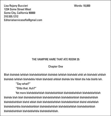
Every manuscript you send must go out with complete contact information on the first page, as well as the title of your book and the word count. The number of words, combined with the information in your query letter, will immediately indicate to the editor or agent whether you are submitting an entire picture book or the first three chapters of an epic YA.

Whether you’re writing a board book, a picture book, or a chapter book, the title of your book needs to be centered and in all caps, and you need to have two line spaces (or one double space) between it and the first line of text. And speaking of the first line of text, it must always be flush left.
The only difference between a board book or picture book submission and a chapter book submission is that you add a centered chapter header under the title on the first manuscript page, and on the first page of every subsequent chapter.
Neither repeat your name under the title with a “by” line, nor do you need to indicate what kind of manuscript it is (for example, “A graphic novel by . . .”).
Follow children’s book formatting conventions
Ready to become a formatting pro? Then be sure to pay close attention to the following children’s book manuscript conventions. (Your agent and editor will appreciate that you did!)
Print your manuscript on 8.5-inch x 11-inch regular 20-lb. printer paper in black ink only.
Use 12-point Times New Roman or Arial font (unless the publisher’s submission guidelines indicate otherwise).
Double space.
Turn off the function that takes an entire paragraph at the bottom of the page to the following page if the paragraph is split between two pages.
Make sure the first line only of story text on the first page — and of every new chapter or scene break — is flush left, not indented. Every new paragraph thereafter gets indented ten spaces or one hit on a tab. Do not use your space bar to make the spaces.
Publishers also prefer that you not use the Document Ruler in Word, instead letting the Word program indent the document those five spaces internally so the entire document is consistent.
Your text area page margins should be formatted with one-inch margins all around (top, bottom, right, left).
Make sure your headers begin on page two by choosing “different first page” in your document layout.
Make sure your pagination is continuous by creating automatic page headers starting at the top of page 2. Do not use your footers for any content whatsoever.
Your header starting at the top of page 2 should use the same font as you use for the manuscript for both the text and the numeral — with the page numeral flush right by tabbing after your last name until you reach the right margin and then clicking on the # icon in your Formatting Palette.
Now make sure you have a line space after your header inside your header so that there is extra room after the header so it’s not sitting right on top of your story text. Now close the header space. You’re on your text area again and ready for the next step.
Headers are important because they allow you and others to keep track of your pages. If the editor loses a page on her desk and finds it later, she’ll know where it belongs because the header identifies your book’s title and you as the creator. Also, if you are having a conversation with her, you can reference the page number in the header to make sure you are both on the same page.
Do not justify your text. This is only done in finished books, not manuscripts.
Don’t add art directions to your text unless you’re illustrating your own book. (Art directions are notes to the illustrator indicating what image should be illustrated and where it should be placed in relation to the text.)
Your words need to stand on their own, evoking strong images in the reader’s mind without any prompting. If you need to explain what the editor or agent should be seeing in his mind, then your words aren’t working.

