

A statistical graph can give you a false picture of the statistics on which it is based. For example, it can be misleading through its choice of scale on the frequency/relative frequency axis (that is, the axis where the amounts in each group are reported), and/or its starting value.
By using a "stretched out" scale (for example, having each half inch of a bar represent 10 units versus 50 units), you can stretch the truth, make differences look more dramatic, or exaggerate values. Truth-stretching can also occur if the frequency axis starts out at a number that's very close to where the differences in the heights of the bars start; you are in essence chopping off the bottom of the bars (the less exciting part) and just showing their tops, emphasizing (in a misleading way) where the action is. Not every frequency axis has to start at zero, but watch for situations that elevate the differences.
Here's a good example of a graph with a stretched out scale:
The Kansas Lottery routinely shows its recent results from the Pick 3 Lottery. One of the statistics reported is the number of times each number (0 through 9) is drawn among the three winning numbers. The table shows a chart of the number of times each number was drawn during 1,613 total Pick 3 games (4,839 single numbers drawn). It also reports the percentage of times that each number was drawn. Depending on how you choose to look at these results, you can make the statistics appear to tell very different stories.
| Numbers Drawn in the Pick 3 Lottery | ||
| Number Drawn | No. of Times Drawn out of 4,839 | Percentage of Times Drawn (No. of Times Drawn ÷ 4,839) |
|---|---|---|
| 0 | 485 | 10.0% |
| 1 | 468 | 9.7% |
| 2 | 513 | 10.6% |
| 3 | 491 | 10.1% |
| 4 | 484 | 10.0% |
| 5 | 480 | 9.9% |
| 6 | 487 | 10.1% |
| 7 | 482 | 10.0% |
| 8 | 475 | 9.8% |
| 9 | 474 | 9.8% |
The way lotteries typically display results like those in the table is shown in the top graph in the following image.
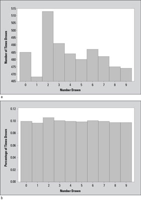
Notice that in this chart, it seems that the number 1 doesn't get drawn nearly as often (only 468 times) as number 2 does (513 times). The difference in the height of these two bars appears to be very large, exaggerating the difference in the number of times these two numbers were drawn. However, to put this in perspective, the actual difference here is 513 – 468 = 45 out of a total of 4,839 numbers drawn. In terms of percentages, the difference between the number of times the number 1 and the number 2 are drawn is 45 ÷ 4,839 = 0.009, or only nine-tenths of one percent (0.009 x 100% = 0.9%).
Why was the top graph in the image made this way? It might lead people to think they've got an inside edge if they choose the number 2 because it's "on a hot streak"; or they might be led to choose the number 1 because it's "due to come up." Both of these theories are wrong, by the way; because the numbers are chosen at random, what happened in the past doesn't matter. The bottom graph in the figure has been made correctly.


