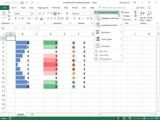
When you click the Conditional Formatting button in the Styles group of the Home tab, a drop-down menu appears with the following options:
- Highlight Cells Rules opens a continuation menu with various options for defining formatting rules that highlight the cells in the cell selection that contain certain values, text, or dates; that have values greater or less than a particular value; or that fall within a certain ranges of values.
- Top/Bottom Rules opens a continuation menu with various options for defining formatting rules that highlight the top and bottom values, percentages, and above and below average values in the cell selection.
- Data Bars opens a palette with different color data bars that you can apply to the cell selection to indicate their values relative to each other by clicking the data bar thumbnail.
- Color Scales opens a palette with different two- and three-colored scales that you can apply to the cell selection to indicate their values relative to each other by clicking the color scale thumbnail.
- Icon Sets opens a palette with different sets of icons that you can apply to the cell selection to indicate their values relative to each other by clicking the icon set.
- New Rule opens the New Formatting Rule dialog box where you define a custom conditional formatting rule to apply to the cell selection.
- Clear Rules opens a continuation menu where you can remove conditional formatting rules for the cell selection by clicking the Clear Rules from Selected Cells option, for the entire worksheet by clicking the Clear Rules from Entire Sheet option, or for just the current data table by clicking the Clear Rules from This Table option. If you’re working with a Pivot Table, you can clear the conditional formatting from it by clicking the Clear Rules from This PivotTable option at the very bottom of this menu.
- Manage Rules opens the Conditional Formatting Rules Manager dialog box where you edit and delete particular rules as well as adjust their rule precedence by moving them up or down in the Rules list box.
Formatting in Excel 2019 with scales and markers
The easiest conditional formatting that you can apply to a worksheet cell range is using the pop-up palettes of graphical scales and markers attached to the Data Bars, Color Scales, and Icon Sets options on the Conditional Formatting button’s drop-down menu:- Data Bars represent the relative values in the cell selection by the length of the color bar in each cell and are great for helping you quickly spot the lower and higher values within a large range of data.
- Color Scales classify the relative values in a cell selection with a color gradation using a one-, two-, or three-color scale and are great for identifying the distribution of values across a large range of data.
- Icon Sets classify the values in the cell selection into particular graphic sets arranged in four categories, and each icon within a set represents a range of values that go from high to low. Icon sets are great for quickly identifying the different ranges of values in a range of data.
 Sample worksheet with three identical cell ranges formatted with Excel’s Data Bars, Color Scales, and Icon Sets options.
In this image, the particular conditional formatting types Excel assigned to each cell range can be interpreted as follows:
- Data bars added to the cells in the first cell range, B2:B12, represent the relative size of its values graphically, much like a standard bar chart.
- Color scales applied to the second range, D2:D12, represent the relative size of the values in the range by color and hue (red hues applied to the lower values, yellow to the middle values, and green to the higher values).
- Directional icons applied to the third cell range, F2:F12, represent the relative size of the values in the range with arrow icons pointing in different directions (arrows pointing straight down for the lower values, straight up for the higher values, and sideways for middling values).
Highlighting cells ranges in Excel 2019
The Highlight Cells Rules and Top/Bottom Rules options on Excel’s Conditional Formatting drop-down menu enable you to quickly identify cell entries of particular interest in various cell ranges in your worksheet.The options on the Highlight Cells Rules continuation menu enable you to set formats that identify values that are greater than, less than, equal to, or even between particular values that you set. This menu also contains an option for setting special formats for identifying cells that contain particular text (such as Yes, No, or even Maybe answers in a data list) or certain dates (such as project milestones and deadlines).
Perhaps one of the most useful options on the Highlight Cells Rules continuation menu is the Duplicate Values option that enables you to flag duplicate entries in a cell range by assigning them a special formatting. Doing this not only makes it easy to visually identify duplicate entries in a data list or table but also to find them electronically by searching for their particular formatting characteristics.
The options on the Top/Bottom Rules continuation menu enable you to specially format and, therefore, easily identify values in data tables and lists that are either above or below the norm. These options not only include those for automatically formatting all values in a range that are among the top 10 highest or lowest (either in value or percentage) but also above or below the average (as calculated by dividing the total by the number of values).In addition to using the ready-made rules for conditional formatting located on the Highlight Cells Rules and Top/Bottom Rules continuation menus, you can also create your own custom rules. When you create a custom rule, you not only specify the rule type that identifies which values or text entries to format, but also you format the colors and other aspects included in the formatting. (For details on creating custom conditional formats, consult Excel 2019 All-in-One For Dummies.)
Excel 2019 Formatting via the Quick Analysis tool
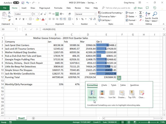
One of the quickest and easiest ways to apply Data Bars, Color Scales, Icon Set, Greater Than, or Top 10% conditional formatting to a data table is with the Excel 2019’s Quick Analysis tool. The coolest thing about applying conditional formatting in this manner is that Live Preview lets you visualize how your data looks with a particular type of conditional formatting before you actually apply it.To assign conditional formatting with the Quick Analysis tool, select the data in your table that you wanted formatted and then select the Quick Analysis tool. By default, the Formatting option is selected when Excel displays the tool’s palette so that all you have to do is highlight each of the formatting options with your mouse or Touch pointer to see how they will look on your data.
The image below shows you the Live Preview of the financial data in the Mother Goose 2016 Sales table with the Data Bars conditional formatting (as the Data Bars button is highlighted in the Formatting options). To assign this conditional format to the financial data in the selected table, you simply click the Data Bars button on the Quick Analysis palette. To preview how the data would look formatted with another conditional format, you simply highlight its button with the mouse or Touch pointer.
 Previewing conditional formatting in a data table using the Quick Analysis tool.
Note that if you click the Greater Than button on the Quick Analysis palette, Excel displays a Greater Than dialog box where you specify the threshold value in the Format Cells That Are Greater Than text box, as well as select the color of the formatting for all the cells above that threshold in the drop-down list to its right.
With all the other kinds of conditional formats (Data Bars, Color Scales, Icon Set, and Top 10%), Excel just goes ahead and applies the first (default) option for that kind of formatting that you find on the Conditional Formatting button’s drop-down menus on the Ribbon.


