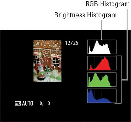
Press the Multi Selector down to shift from Highlights mode to this mode on your Nikon D5300. You can view your picture in this mode only if you enable it via the Display Mode option on the Playback menu.

Underneath the image thumbnail, you see just a few pieces of data. As with File Information mode, you see the Protected, Retouch, Rating, and Send to Smart Device icons if you used those features. Beneath that, you see the White Balance settings used for the shot.
The data shows that the picture was captured using the Auto White Balance with zero adjustment along the blue-to-amber axis and zero adjustment along the green-to-magenta axis. At the top of the display, you see the File number/Total files data, also part of the standard File Information display data.
The keys to this display mode, though, are those chart-like thingies called histograms. You get two types of histograms: The top one is a Brightness histogram; the three others are known collectively as an RGB (red, green, blue) histogram.
Here's a cool trick to remember: If you press the Zoom In button while in this display mode, you can zoom the thumbnail to a magnified view. The histograms then update to reflect only the magnified area of the photo. Use the Multi Selector to scroll the display to see other areas of the picture. To return to the regular view and once again see the whole-image histogram, press OK.
How to read a Brightness histogram
You can get an idea of image exposure by viewing your photo on the camera monitor and by looking at the blinkies in Highlight mode. But the Brightness histogram provides a way to gauge exposure that's a little more detailed.
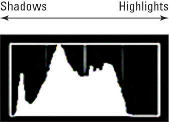
A Brightness histogram indicates the distribution of shadows, highlights, and midtones (areas of medium brightness) in an image.

The horizontal axis of the histogram represents the possible picture brightness values—the maximum tonal range, in photography-speak—from the darkest shadows on the left to the brightest highlights on the right. And the vertical axis shows you how many pixels fall at a particular brightness value. A spike indicates a heavy concentration of pixels at that brightness value.
Keep in mind that there is no “perfect” histogram that you should try to achieve. Instead, interpret the histogram with respect to the distribution of shadows, highlights, and midtones that comprise your subject. You wouldn't expect to see lots of shadows, for example, in a photo of a polar bear walking on a snowy landscape.
Pay attention, however, if you see a very high concentration of pixels at the far right or left end of the histogram, which can indicate a seriously overexposed or underexposed image, respectively.
When shooting subjects that contain a significant amount of white, such as the gingerbread house, you can underexpose the photo just a hair. That way, you make sure that you don't blow out highlights. In such cases, the histogram may show no or few pixels at the right end of the scale.
You have to read the histogram with an eye toward getting the exposure of the main subject correct. If you increase exposure enough to get some pixel population on the highlights end of the histogram, you can easily lose detail. (This is a good situation in which to use the autoexposure bracketing feature.)
RGB histograms
When you view your images in RGB Histogram display mode, you see two histograms: the Brightness histogram and an RGB histogram.

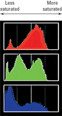
To make sense of an RGB histogram, you first need to know that digital images are known as RGB images because they're created from three primary colors of light: red, green, and blue. Whereas the Brightness histogram reflects the brightness of all three color channels rolled into one, RGB histograms let you view the values for each channel.
When you look at the brightness data for a single channel, though, you glean information about color saturation rather than image brightness. (Saturation refers to the purity of a color; a fully saturated color contains no black or white.)
The short story is that when you mix red, green, and blue light, and each component is at maximum brightness, you create white. Zero brightness in all three channels creates black. If you have maximum red and no blue or green, though, you have fully saturated red. If you mix two channels at maximum brightness, you also create full saturation.
For example, maximum red and blue produce fully saturated magenta. And, wherever colors are fully saturated, you can lose picture detail. For example, a rose petal that should have a range of tones from medium to dark red may instead be a flat blob of pure red.
The upshot is that if all the pixels for one or two channels are slammed to the right end of the histogram, you may be losing picture detail because of overly saturated colors. If all three channels show a heavy pixel population at the right end of the histogram, you may have blown highlights. Either way, you may want to adjust the exposure settings and try again.
A savvy RGB histogram reader can also spot color balance issues by looking at the pixel values. But frankly, color balance problems are fairly easy to notice just by looking at the image on the camera monitor.


