

HTML5 and CSS3 web developers can use AJAX to make a responsive mobile site. One way to make a site work well on multiple resolutions is to provide different CSS rules based on the detected media type.
CSS3 has a marvelous new feature called the media query, which allows you to specify a media type and determine various features of the display. You can use this specification to build a subset of the CSS that should be used when the browser detects a certain type or size of display.
Specify a media type
The @media rule allows you to specify what type of output the included CSS should modify. The most common media types are screen, print, speech, handheld, projection, and tv. There are more, but only print and screen are universally supported.
For example, the following code will specify the font size when the user prints the document:
@media print {
 body {
 font-size: 10pt;
 }
}
This CSS can be embedded into a normal CSS document, but it should typically be placed at the end of the document because it holds exceptions to the normal rules. You can place as much CSS code as you wish inside the @media element, but you should only put CSS code that's relevant to the specific situation you're interested in.
How to add a qualifier
In addition to specifying the media type, the @media rule has another very powerful trick. You can apply a special qualifying condition to the media.
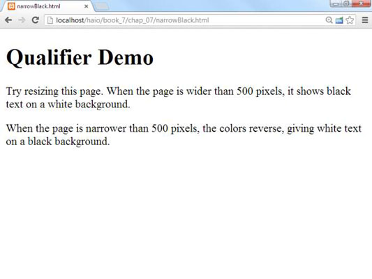
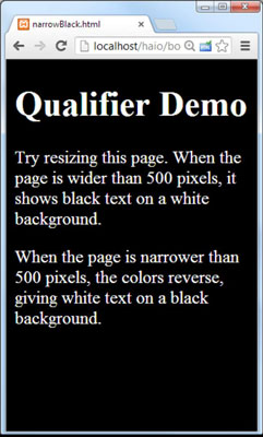
When the browser is wider than 500 pixels, you can see black text on a white background. But make the screen narrower, and you see something interesting.
Normally you would use this trick to change the layout, but start with this simpler color-changing example. Here's the code for this simpler example:
<!doctype html>
<html lang="en">
<head>
 <title>narrowBlack.html</title>
 <meta charset="UTF-8">
     <meta name="viewport" content="width=device-width, user-scalable=false;">
 <style type = "text/css">
 body {
 color: black;
 background-color: white;
 }
 @media (max-width: 500px){
 body {
  color: white;
  background-color: black;
 }
 }
 </style>
</head>
<body>
 <h1>Qualifier Demo</h1>
 <p>
 Try resizing this page. When the page is
 wider than 500 pixels, it shows black text on a
 white background.
 </p>
 <p>
 When the page is narrower than 500 pixels, the colors
 reverse, giving white text on a black background.
 </p>
</body>
</html>
Here's how to build a page that adapts to the screen width:
Build your site as usual.
This is one place where that whole “separate content from layout” thing really pays off. The same HTML will have two different styles.
Apply a CSS style in the normal way.
Build your standard style in the normal way — for now, embed the style in the page with the tag. Your main style should handle the most common case. (Typically, a full-size desktop.)
Build a @media rule.
The @media CSS rule should go at the end of the normal CSS.
Set a max-width:500px qualifier.
This qualifier indicates that the rules inside this segment will only be used if the width of the screen is smaller than 500 pixels.
Place special case rules inside the new style set.
Any CSS rules you define inside the @media rule will be activated if the qualifier is true. Use these rules to override the existing CSS. Note you don't have to redefine everything. Just supply rules that make sense in your particular context.
Add a viewport.
Mobile browsers will sometimes try to rescale the page so it can all be seen at once. This defeats the purpose of a special style, so use the viewport metatag to indicate that the browser should report its true width. It's also often useful to turn off page-scaling because it should no longer be necessary.
In this example, the browser always applies the main (black text on a white background) style. Then it looks at the @media rule to see if the qualifier is true.
If the width is less than 500 pixels, the max-width:500px qualifier is evaluated to true, and all the CSS code inside the @media segment is enabled. The browser then stores both sets of CSS and applies the correct CSS based on the status of the rule.

