

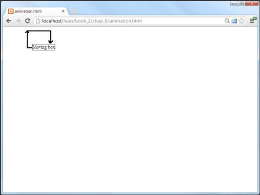
The transform behavior is pretty cool, but CSS3 promises an even more exciting form of animation called the (wait for it) animation mechanism. Here is an animation of a box moving around the screen.
Here's the basic strategy for building a CSS animation:
Generate a set of keyframes.
Animations are based on the notion of keyframes. Each keyframe specifies the state of an object, and the browser attempts to smoothly transition between keyframes.
Provide a percentage for each keyframe.
The keyframe starts with a percentage, indicating where in the animation the keyframe will happen. The first keyframe should be 0% (the beginning of the animation) and the last should be 100% (the end of the animation). You can indicate as many intermediate keyframes as you want.
Add a mini style sheet for each keyframe.
Place any styles you want modified in a little style sheet. At the indicated place in the timeline, an element following this animation will display the given style behavior. You can place any style information you want here.
Apply the animation to your elements.
The animation rule allows you to apply a keyframe to an element. You can reuse the same keyframes among many different elements if you want.
Modify the animation.
You can apply many of the same characteristics to an animation as you do a transition. There are a number of parameters, but the most commonly used elements are keyframe, time, and repeat.
Take a look at the code for animation.html to see it all in action:
<!doctype html>
<html lang="en">
<head> <meta charset="UTF-8"> <title>animation.html</title>
 <style type = "text/css"> @keyframes anim { 0% {left :0px; top: 0px;} 25% {left :100px; top: 0px;} 50% {left :100px; top: 100px;} 75% {left :0px; top: 100px;} 100% {left: 0px; top: 0px;} } @-webkit-keyframes anim { 0% {left :0px; top: 0px;} 25% {left :100px; top: 0px;} 50% {left :100px; top: 100px;} 75% {left :0px; top: 100px;} 100% {left: 0px; top: 0px;} } @-moz-keyframes anim { 0% {left :0px; top: 0px;} 25% {left :100px; top: 0px;} 50% {left :100px; top: 100px;} 75% {left :0px; top: 100px;} 100% {left: 0px; top: 0px;} } @-o-keyframes anim { 0% {left :0px; top: 0px;} 25% {left :100px; top: 0px;} 50% {left :100px; top: 100px;} 75% {left :0px; top: 100px;} 100% {left: 0px; top: 0px;} } #box { position: absolute; border: 1px solid black; -webkit-animation: anim 5s linear infinite; -moz-animation: anim 5s linear infinite; -o-animation: anim 5s linear infinite; animation:  anim 5s linear infinite; }
 </style>
</head>
<body> <div id = "box">Moving box</div>
</body>
</html>
There are a number of things to note about this example:
Create a keyframes set called The @keyframes rule is used to create a page-level resource that can be used in the rest of the CSS. In this case, it's used to generate a keyframe set.
Build browser-specific versions: Unfortunately, the animation mechanism still requires browser-specific prefixes. It's usually easiest to target one browser and then copy for the other browsers when the basic behavior is working.
This example moves an element in a square pattern: For this particular example, a div will move in a square motion. As you look at the keyframes, you'll see that a simple change to the left and top position of the div was made throughout time.
Make beginning and end the same: If you plan to run this animation continuously, you want the beginning and ending places to be the same.
Apply the anim keyframe set to the element: Apply the anim keyframe set by using the animation rule.
Indicate the length of the animation: Animations are about changes over time, so the animation tag also requires a duration, measured in seconds (s) or milliseconds (ms).
Determine the easing: Easing is how the animation acts at the beginning and end of an animation segment. The linear rule used here keeps the animation at a constant speed. You can also use (the default behavior) ease-in-out to make the element move at a variable rate.
Determine the number of repetitions: You can specify a number of times to repeat the animation. If you leave this part out, the animation will happen only once when the page first loads. You can specify infinite to make the animation repeat as long as the page is in memory.
Note there are many other parameters you can set, such as easing and delay. These can be set through the animation rule or with individual rules. For now, you may want to keep your animations as simple as possible, at least until the browsers can all manage animations without vendor prefixes.

