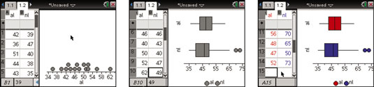
To graph a second box plot on the TI-Nspire containing the National League data, press [MENU]→Plot Properties→Add X Variable and choose nl to create the second box plot.
The second screen shows the second box plot representing the National League results. Notice that two outliers appear on this graph.
To hide outliers, press [MENU]→Plot Properties→Extend Box Plot Whiskers. To reveal outliers (if they exist), press [MENU]→Plot Properties→Show Box Plot Outliers.
TI-Nspire does not automatically use color in a Data & Statistics environment. You probably like to use color when you are comparing data; color helps to differentiate between the different data representations. To change the AL box plot to red, press [CTRL][MENU]→Color→Fill Color.
Repeat this step to change the NL box plot to blue. To further make the connection between the data in the table and the data represented in the box plot, change the text color in the table to match the box plots. First, select the column by clicking the capital letter at the top of each column, and then right-click by pressing [CTRL][MENU]→Color→Text Color. See the results in the third screen.