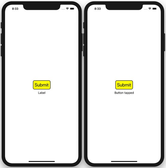
Before SwiftUI was introduced, most developers use UIKit and Storyboard (which is still supported by Apple in the current version of Xcode to design a UI. Using UIKit and Storyboard, developers drag and drop View controls onto View Controllers and connect them to outlets and actions on the View Controller classes. This model of building UIs is known as Model View Controller (MVC), which creates a clean separation between UI and business logic.
The following shows a simple implementation in UIKit and Storyboard. Here, a Button and Label view have been added to the View Controller in Storyboard; two outlets and an action have been created to connect to them:
class ViewController: UIViewController {  <strong>  @IBOutlet weak var lbl: UILabel!
    @IBOutlet weak var button: UIButton!
    @IBAction func btnClicked(_ sender: Any) {
        lbl.text = "Button tapped"
    }</strong>
For laying out the views, you use auto-layout to position the button and label in the middle of the screen (both horizontally and vertically).To customize the look and feel of the button, you can code it in the loadView() method, like this:
    override func loadView() {
        super.loadView()        <strong>// background color
        button.backgroundColor = UIColor.yellow        // button text and color
        button.setTitle("Submit", for: .normal)
        button.setTitleColor(.black, for: .normal)        // padding
        button.contentEdgeInsets = UIEdgeInsets(
            top: 10, left: 10, bottom: 10, right: 10)        // border
        button.layer.borderColor =
            UIColor.darkGray.cgColor
        button.layer.borderWidth = 3.0        // text font
        button.titleLabel!.font =
            UIFont.systemFont(ofSize: 26, weight:
            UIFont.Weight.regular)        // rounder corners
        button.layer.cornerRadius = 10        // auto adjust button size
        button.sizeToFit()
 </strong>   }
The following image shows the button that has customized. UIKit is an event-driven framework, where you can reference each view in your view controller, update its appearance, or handle an event through delegates when some events occurred. UIKit is event driven, and it uses delegates to handle events.
In contrast, SwiftUI is a state-driven, declarative framework. In SwiftUI, you can implement all the above with the following statements:
struct ContentView: View {
  <strong>  @State private var label = "label"</strong>    var body: some View {
        <strong>VStack {
            Button(action: {
                self.label = "Button tapped"
            }) {
                Text("Submit")
                    .padding(EdgeInsets(
                        top: 10, leading: 10,
                        bottom: 10, trailing: 10))
                    .background(Color.yellow)
                    .foregroundColor(Color.black)
                    .border(Color.gray, width: 3)
                    .font(Font.system(size: 26.0))
                    .overlay(
                        RoundedRectangle(cornerRadius: 10)
                            .stroke(Color.gray,
                                lineWidth: 5)
      </strong>             <strong> )
            }
            Text(label)
                .padding()
        }</strong>
    }
}
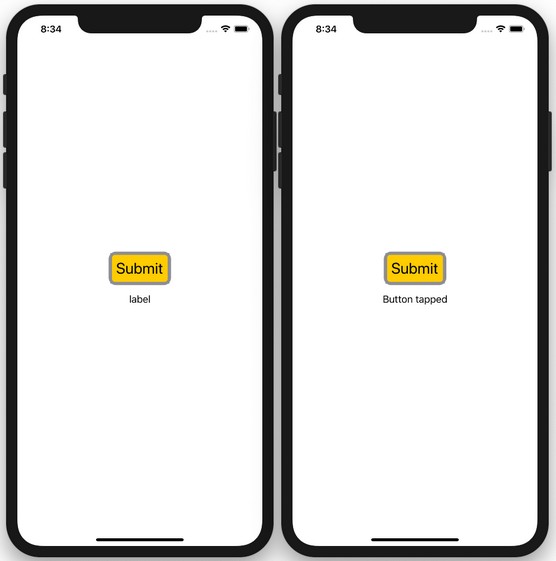
Notice that all the views are now created declaratively using code — no more drag-and-drop in Storyboard. Layouts are now also specified declaratively using code (the VStack in this example stacks all the views vertically). Delegates are now replaced with closures.More important, views are now a function of state (and not a sequence of events) — the text displayed by the Text view is now bound to the state variable label. When the button is tapped, you change the value of the label state variable, which automatically updates the text displayed in the Text view. This programming paradigm is known as reactive programming.
The image below shows the various views in action.
 SwiftUI is a state-driven declarative framework.
Want to learn more? Check out our SwiftUI Cheat Sheet.


