


A web app is something like the online equivalent of a desktop program, but that doesn’t mean you should build your web app to look good and work properly only on desktop-sized screens. Why not? For the simple reason that your app’s visitors will be using a wide range of device sizes, from PCs with gigantic displays several feet wide, all the way down to smartphones with screens just a few inches wide. On the modern web, one size definitely does not fit all, so you need to plan your app so that its user experience (UX, to the cognoscenti) — that is, what visitors see and interact with — is positive for everyone.
 A typical page with header, navigation, an article, and two sidebars. On a desktop screen, the article is flanked by the sidebars.
 On a narrower tablet-sized screen, the right sidebar wraps below the left sidebar and the article.
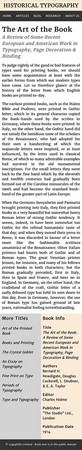 On an even narrower smartphone-sized screen, both sidebars appear below the article.
To make your web app look good and operate well on any size screen, you need to plan your app with responsiveness in mind. A responsive web app is one that changes its layout, styling, and often also its content to ensure that the app works on whatever screen the reader is using.
To see why you need to code responsively from the start of your web app, consider the two main non-responsive layouts you could otherwise use:- Fixed-width: A layout where the width of the content is set to a fixed size. In this case, if the fixed-width is greater than the width of the screen, most of the time the user has to scroll horizontally to see all the content.
 When a page has a fixed width, users with small screens have to scroll horizontally to see all the content.
 - No-width: A layout where the width of the content has no set width. You might think having no width would enable the text and images to wrap nicely on a small screen, and you’d be right. However, the problem is on larger screens, where your text lines expand to fill the browser width and, as you can see, those lines can become ridiculously long, to the point where scanning the lines becomes just about impossible.
 When a page has no maximum width, the lines of text become too long for comfortable reading.
To work around these problems and to ensure your web app looks good on any screen size, you need to implement the following responsive techniques:
- Set the viewport: To ensure that your layout works well in smaller screens, use the following
<meta>tag to tell the browser to set the viewport width to the width of the current device's screen, and to set the viewport’s zoom level to 1 (that is, not zoomed in or zoomed out).
<meta name="viewport" content="width=device-width, initial-scale=1.0">
- Liquid layout: A layout in which the overall width is set to a maximum (so that text lines never get too long to read), but the page elements have their widths set in percentages (or a similar relative measure such as viewport width:
vw). Since even really old web browsers support percentages, this is a good fallback layout to use. For example:
body {
  max-width: 800px;
}
article {
  width: 67%;
}
aside {
  width: 33%;
}
HTML:
<body>
  <main>
    <article>
    </article>
    <aside>
    </aside>
  </main>
</body>
- Flexible layout: A layout that uses flexbox to automatically wrap items when the browser window is too narrow to contain them. You set the container’s
flex-wrapproperty towrap, as shown in the following example:
body {
  max-width: 800px;
}
main {
  display: flex;
  flex-wrap: wrap;
}
article {
  flex-grow: 2;
  flex-shrink: 0;
  flex-basis: 300px;
}
aside {
  flex-grow: 1;
  flex-shrink: 0;
  flex-basis: 150px;
}
HTML:
<body>
  <main>
    <article>
    </article>
    <aside>
    </aside>
  </main>
</body>
- Adaptive layout: A layout that changes depending on the current value of certain screen features, such as width. An adaptive layout uses a CSS feature called a media query, which is an expression accompanied by a code block consisting of one or more style rules. The expression interrogates some feature of the screen, usually its width. If that expression is true for the current device, then the browser applies the media query's style rules; if the expression is false, the browser ignores the media query’s rules. Here’s the syntax:
@media (<em>expression</em>) {
  <em>Style rules go here</em>
}Here’s an example that applies two style rules whenever the current screen width is less than or equal to <code>767px</code>:
@media (max-width: 767px) {
  header {
    height: 48px;
  }
  .site-title {
    font-size: 24px;
  }
}
- Responsive images: Renders an image fluidly so that its size adjusts to different screen sizes. Ideally, you want the image to scale no larger than its original size to avoid ugly pixilation and jagged edges, and you want the width and height to maintain the original aspect ratio so that the image doesn’t look skewed when its size changes. You can achieve both goals by styling the image with the declarations
max-height: 100%, which allows the image to scale but to grow no larger than its original size, andheight: auto, which tells the browser to adjust the height automatically as the width changes. (Alternatively, you can setwidth: autoto get the browser to adjust the width automatically as the height changes). Here's an example:
A typical page with header, navigation, an article, and two sidebars. On a desktop screen, the article is flanked by the sidebars..aside-img {
max-height: 100%;
height: auto;
}
On a narrower tablet-sized screen, the right sidebar wraps below the left sidebar and the article.
- Responsive typography: Renders font sizes and vertical measures with the relative units
emorremrather than fixed-size pixels (px); renders horizontal measures in percentages (%) instead of pixels (px). Using relative measurement units enables the page typography to flow seamlessly as the screen size changes.
On an even narrower smartphone-sized screen, both sidebars appear below the article.
