A simple list of buttons can look better than ordinary HTML5 links, but sometimes, your page needs to have a more complex navigation scheme. For example, you may want to create a menu system to help the user see the structure of your site.
Building a nested list
Begin by creating a system of nested lists without any CSS at all.
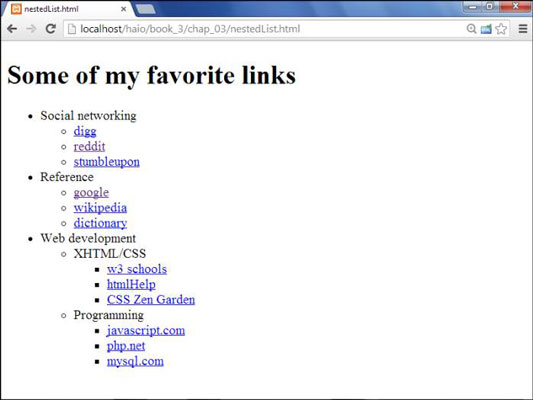
No CSS styling is in place yet, but the list has its own complexities:
The primary list has three entries. This is actually a multilayer list. The top level indicates categories, not necessarily links.
Each element in the top list has its own sublist. A second layer of links has various links in most elements.
The web Development element has another layer of sublists. The general layout of this list entry corresponds to a complex hierarchy of information — like most complex websites.
The list validates to the HTML Strict standard. It's especially important to validate your code before adding CSS when it involves somewhat complex HTML code, like the multilevel list. A small problem in the HTML structure that may go unnoticed in a plain HTML document can cause all kinds of strange problems in your CSS.
Here is the code for the nested list in plain HTML:
<!DOCTYPE html>
<html lang = "en-US">
 <head>
 <meta charset = "UTF-8">
 <title>nestedList.html</title>
 </head>
 <body>
 <h1>Some of my favorite links</h1>
 <ul>
  <li>Social networking
  <ul>
   <li><a href = "http://www.digg.com">digg</a></li>
   <li><a href = "http://www.reddit.com">reddit</a></li>
   <li><a href = "http://www.stumbleupon.com">stumbleupon</a></li>
  </ul>
  </li>
  <li>Reference
  <ul>
   <li><a href = "http://www.google.com">google</a></li>
   <li><a href = "http://wikipedia.org">wikipedia</a></li>
   <li><a href = "http://dictionary.com">dictionary</a></li>
  </ul>
  </li>
  <li>web development
  <ul>
   <li>XHTML/CSS
   <ul>
    <li><a href = "http://www.w3schools.com">w3 schools</a></li>
    <li><a href = "http://htmlhelp.com">htmlHelp</a></li>
    <li><a href = "http://www.csszengarden.com">CSS Zen Garden</a></li>
   </ul>
   </li>
   <li>Programming
   <ul>
    <li><a href = "http://javascript.com">javascript.com</a></li>
    <li><a href = "http://php.net">php.net</a></li>
    <li><a href = "http://www.mysql.com">mysql.com</a></li>
   </ul>
   </li>
  </ul>
  </li>
 </ul>
 </body>
</html>
Take special care with your indentation when making a complex nested list like this one. Without proper indentation, it becomes very difficult to establish the structure of the page. Also, a list item can contain text and another list. Any other arrangement will cause a validation error.
Hiding the inner lists
The first step of creating a dynamic menu system is to hide any lists that are embedded in a list item. Add the following CSS style to your page:
li ul {
 display: none;
}
In reality, you usually apply this technique only to a specially marked div, like a menu system.
Your page will undergo a startling transformation.
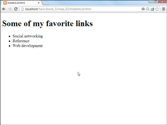
That tiny little snippet of CSS code is a real powerhouse. It does some fascinating things, such as
Operating on unordered lists that appear inside list items: What this really means is the topmost list won't be affected, but any unordered list that appears inside a list item will have the style applied.
Using display:none to make text disappear: Setting the display attribute to tells the HTML page to hide the given data altogether.
This code works well on almost all browsers.
Getting the inner lists to appear on cue
The fun part is getting the interior lists to pop up when the mouse is over the parent element. A second CSS style can make this happen:
li ul {
 display: none;
}
li:hover ul {
 display: block;
}
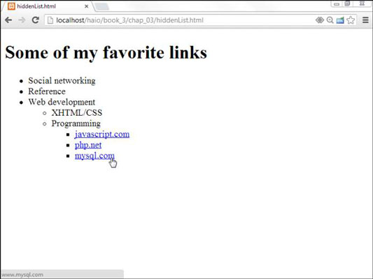
The new code is pretty interesting. Check out the effect of holding the mouse over the Social Networking element.

This code doesn't work on all browsers! Internet Explorer 6 (IE6) and earlier versions don't support the :hover pseudo-class on any element except a. Provide a conditional comment with an alternative style for early versions of IE. All modern browsers (including IE 7 and later) work fine.
Here's how the list-reappearing code works:
All lists inside lists are hidden. The first style rule hides any list that's inside a list element.
li:hover refers to a list item that's being hovered on. That is, if the mouse is situated on top of a list item, this rule pertains to it.
li:hover ul refers to an unordered list inside a hovered list item. In other words, if some content is an unordered list that rests inside a list that currently has the mouse hovering over it, apply this rule.
Display the list as a block. display:block overrides the previous display:none instruction and displays the particular element as a block. The text reappears magically.
This hide-and-seek trick isn't all that great on its own. It's actually quite annoying to have the contents pop up and go away like that. There's another more annoying problem.
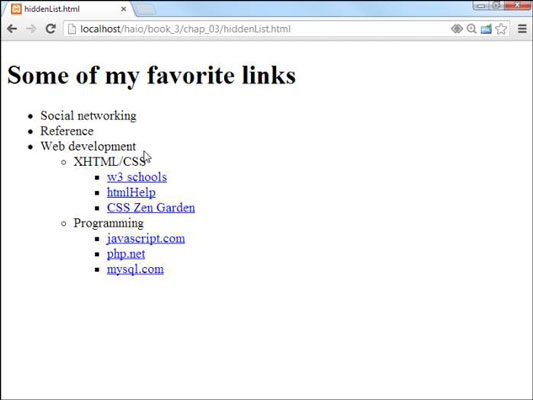
To see why this happens, take another look at the CSS code that causes the segment to reappear:
li:hover ul {
 display: block;
}
This code means set display to block for any ul that's a child of a hovered li. The problem is that the Web Development li contains a ul that contains two more uls. All the lists under web Development appear, not just the immediate child.
One more modification of the CSS fixes this problem:
li ul {
 display: none;
}
li:hover > ul {
 display: block;
}
The greater than symbol (>) is a special selector tool. It indicates a direct relationship. In other words, the ul must be a direct child of the hovered li, not a grandchild or great-grandchild. With this indicator in place, the page acts correctly.
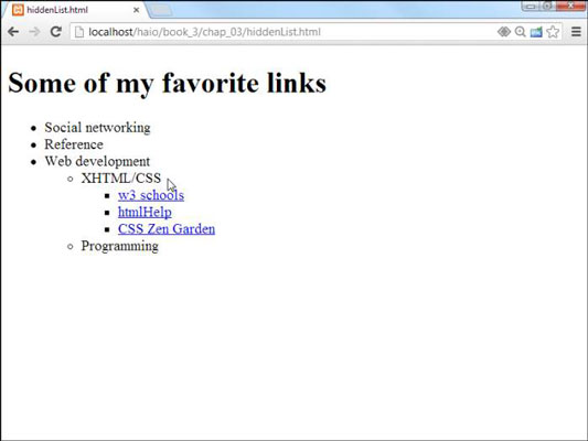
This trick allows you to create nested lists as deeply as you wish and to open any segment by hovering on its parent.
My current code has a list with three levels of nesting, but you can add as many nested lists as you want and use this code to make it act as a dynamic menu.
This type of menu is not necessarily a good idea. Having stuff pop around like this is actually pretty distracting.


