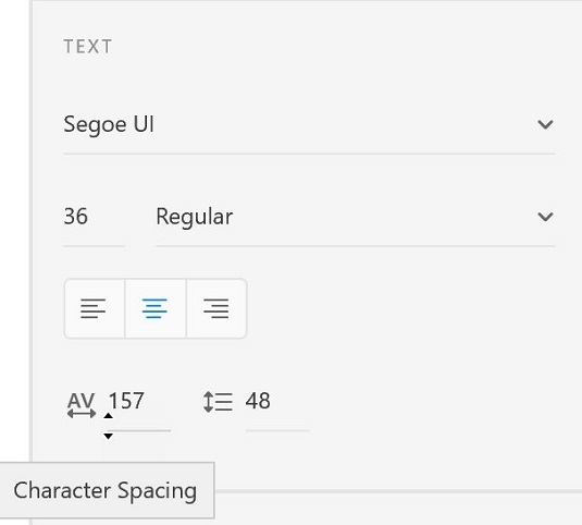
When you have text in your Adobe XD project, you can start changing the text properties. These properties include Font Family, Font Size, Font Weight, Alignment, Character Spacing (kerning and tracking), Line Spacing (leading), Fill, Border (stroke), Shadow (drop shadow), and Background Blur. So let’s review how those properties are applied.
 You can also visually change the size of the character spacing by clicking and dragging.
About readability and font selections
The selection of a font is of critical importance. You may have many font choices in your system, but only a select few will cut it as a successful choice for onscreen reading. Some characteristics to look for in your font selection include the following:- Serif or non-serif? Below, you see a font family in the serif style on the top and one in sans serif on the bottom. Serifs have a slight projection that finishes off a stroke of a letter. Sans serif, on the other hand, does not have that slight projection. Sans serif typefaces tend to look more modern and are a popular choice for interactive applications and websites. In the past, it was believed that font families with serifs were easier to read when there was a large amount of text. Tests performed with eye-tracking devices have proven that there is no major difference in readability between serif or sans-serif, so feel free to pick either style as long as you pay attention to some of the other font characteristics that follow.
 A serif typeface on the top, sans-serif on the bottom.
 - Straight, even line widths: Because your type is going to be created from pixels, it is best not to have lots of variation in the width of your text. You can see the difference, in a pixel preview, between a font choice with variation in the width (top) and a font that is consistent in its width.
 The top font has variation in the thick and thin lines that create the font; the bottom font is consistent and easier to read onscreen.
 - Strong counters: Counters are the holes that you see in letters like “O,” “B,” and “R.” Pay attention to how large those counters are as they can also cause readability issues if they close up when displayed as pixels on a screen. A pixel view of two different font families appears; see how the counters look in each in comparison to each other.
 Look for strong open counters in your font family selection.
 - Descenders and cap height: Short descenders and low cap heights are important for readability on the screen. At the top you see a font family with short descenders and low cap heights; at the bottom, a font with long descenders and high cap heights.
 A font family with short descenders and a low cap height is typically easier to read onscreen.
Selecting your font family
Now that you know what makes a better font selection for readability, use the Properties panel to select one. Things to look for when making your selection include the following:- Font family: After you have entered some type on your screen, you can select it and choose the Font Family drop-down menu in the Text section of the Properties panel. If you know the font you want, simply start typing the font’s name into the Font Family textbox, and if it is in your system, it will be found in your list.
Don’t forget that you have fonts available to you through Adobe TypeKit.
- Font weight: After you select a font family, you can choose a weight from the Font Weight drop-down menu. Depending upon the fonts that you have in your system, you will have different font weight choices.
 Choose a font family and font weight.
 - Font size: You can simply type a font size into the Font Size textbox, but if you are not sure what size works best, you can position your cursor underneath the Font Size textbox and click and drag. Look for the double-headed arrow before you drag. Dragging up decreases the size; down increases the size.
 Click and drag to visually change the font size.
 - Alignment: You can change your selected text to Align Left, Center, or Right using the Alignment buttons in the Text section of the Properties panel.
- Character spacing: Character spacing refers to the space between characters. This is known as tracking. Here, you see the result of increasing the spacing between characters.
 Characters at normal spacing, set at 0 (zero) and then set at 150.
Note that you can use the same click-and-drag technique that is available in the Font Size textbox in order to visually change the character spacing.
 You can also visually change the size of the character spacing by clicking and dragging.
- Line height: Line height is leading, the space between the lines of text. This can play an important role in information design, so make sure that you are using this consistently throughout your design. You can also position your cursor below the Line Height textbox and click and drag up or down to decrease and increase your line height.
- Color: Change the Fill color by clicking on the box next to Fill color in the Properties panel. You perform this task the same way you would with any shape. Select the Fill box and select a color from the Color Picker. You can also select transparency for your text from the Transparency slide available on the right of the Color Picker.
- Border: Applying a border puts a stroke around your text. This is not recommended because it may cause readability issues. Use it sparingly and perhaps only for special effects. The image below shows an example of a larger typeface that has a thin stroke and a white fill on a darker background. In a situation like this, a border could work, but not with smaller text.
 A small border with a white fill on a dark background.


