Turning on your grid
You can turn on a grid that is only visible to you by following these steps:- Select an artboard by clicking the artboard in the Layers panel or clicking the Artboard name above the artboard in your work area.
- Check the checkbox for the Grid in the lower portion of the Properties panel.
 Turn on the Grid feature for your artboard.
 - If you prefer a different color for your grid, select the square to the right of the grid checkbox and select a color from the color picker. You can also use the Transparency slider to change the level of opacity.
- If you like, change the size of the grid by typing a value in the Grid Size textbox to the right of the checkbox.
Be smart about your guides
As a default, XD provides you with guides that turn on as needed. These are called Smart Guides and should be familiar to you if you use other Adobe Products.To use the smart guides, simply pay attention to the lines and shaded areas that appear as you work. Note in the image below that when the one diamond is dragged, a guide appears indicating that it is aligned with the diamond on the left.
 You can use Smart Guides for aligning objects.
Smart guides can help with distribution as well
Distribution of objects refers to the space between a bounding box created by a first object and a last object. Here, you see uneven distribution of several diamonds on the left, and even distribution of the same objects on the right. In this example, the spacing is evenly distributed horizontally. Uneven distribution on the left side and even distribution on the ride side.
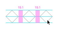
When you position objects, you will see shaded areas appear that indicate when the space between the objects is equal. This shading hint also appears when you Alt/Option drag to clone objects.
 Smart guides provide a hint when space is even between objects.
Using the Align and Distribute feature
The Align and Distribute feature that is available in the Object menu and in the Properties panel can help you keep items in line and spaced evening.If you select two items, you can take advantage of the Alignment features. If you select three or more objects, you can also use the Distribution features.
Keep in mind the trick to determining horizontal versus vertical. The horizon is horizontal. Anything going from left to right on your page should be distributed horizontally. Any objects going from the top to the bottom should be distributed vertically.


