


Sometimes, instead of data labels that can easily obscure the data points in the chart, you’ll want Excel 2013 to draw a data table beneath the chart showing the worksheet data it represents in graphic form.
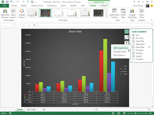
To add a data table to your selected chart and position and format it, click the Chart Elements button next to the chart and then select the Data Table check box before you select one of the following options on its continuation menu:
With Legend Keys to have Excel draw the table at the bottom of the chart, including the color keys used in the legend to differentiate the data series in the first column
No Legend Keys to have Excel draw the table at the bottom of the chart without any legend
More Options to open the Format Data Table task pane on the right side where you can use the options that appear when you select the Fill & Line, Effects, Size & Properties, and Table Options buttons under Table Options and the Text Fill & Outline, Text Effects, and Textbox buttons under Text Options in the task pane to customize almost any aspect of the data table
The figure illustrates how a clustered column chart looks with a data table added to it. This data table includes the legend keys as its first column.
If you decide that having the worksheet data displayed in a table at the bottom of the chart is no longer necessary, simply click to deselect the Data Table check box on the Chart Elements menu.

