In Excel charts, using columns and bars is a great way to compare items side-by-side. Column and Bar charts also handle multiple data series — a key point when considering which Excel chart type to use. Column and Bar charts are effectively the same. The difference is that Column charts display vertical columns and Bar charts display horizontal bars. On a Column chart, the values are on the vertical (y) axis, while on a Bar chart, the values are on the horizontal (x) axis. They each process data the same way.
Making a Column chart
The first task when making a Column chart is to plot the data:
1. Select the data, including both series and headers (all three columns).
2. Click the Chart Wizard button on the Standard toolbar or choose Insert --> Chart.
The Chart Wizard opens with the Column chart type selected by default. It doesn't get any easier than that!
Figure 1 shows the Chart Wizard with the Column chart type selected, and the first subtype. This is what you want.
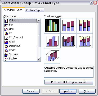
Figure 1: Selecting a Column chart.
3. Click the Next button twice.
The Chart Wizard should now be on Step 3.
4. Click the Titles tab.
5. Enter an appropriate title for the chart.
The example uses the title Summer Vacation Packages Sold. Adding a title is optional, but it's proper chart etiquette.
6. Click Finish.
Figure 2 shows how the chart turned out. The categories (the cities) are correctly placed under the category axis. The legend clues you in to which column represents which data series. This is made possible by the fact that each data series has its own color.
There always must be a way to differentiate multiple series. This is accomplished by applying formatting attributes — color, patterns, line styles, markers, and so on. Each series is somehow uniquely formatted.
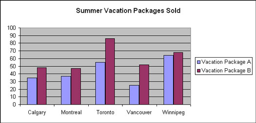
Figure 2: Reviewing the number of sold vacation packages.
The chart in Figure 2 shows how the individual data points, from the two data series, are anchored to their respective categories. The two data series are differentiated by color. This chart makes it easy to see a few key points about the data:
- Winnipeg sold the most of Vacation Package A, and Toronto sold the most of Vacation Package B.
- Overall, Calgary and Montreal performed very similarly.
- Winnipeg sold almost an even amount of A and B packages.
In other words, the Column chart in Figure 2 makes it easy to compare values, whether comparing multiple series per category, or comparing across categories. For example, you can easily see that Toronto outperformed all other cities with regard to Vacation Package B.
Changing the chart type to a Bar chart
A Bar chart presents data in the same way as a Column chart, but it does so horizontally instead of vertically. Here's what you do to change the chart type:
1. Click once on the chart to select it, if it is not already selected.
The menu bar now displays the Chart menu item where the Data menu item usually is found. Figure 3 shows the Chart menu with its various submenus.
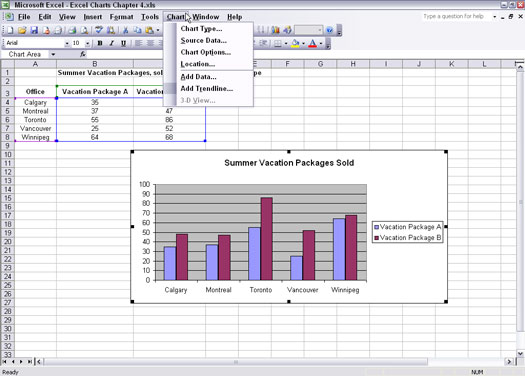
Figure 3: Accessing the Chart menu item.
2. Choose Chart --> Chart Type.
The Chart Type dialog box opens, as shown in Figure 4.
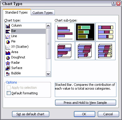
Figure 4: Changing the chart type.
3. Select the Bar chart type, and the first subtype (Clustered Bar).
4. Click OK.
Presto! The Column chart is now a Clustered Bar chart. Figure 5 shows the result of all this effort (hardly an effort at all!). The values of the two vacation packages are still anchored to their respective categories, now along the vertical axis.
A Bar chart typically has the categories on the vertical axis and the values on the horizontal axis.
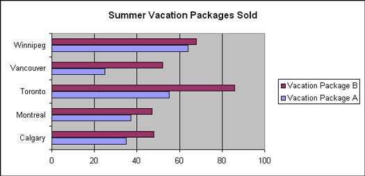
Figure 5: Displaying the data in a Bar chart.


