Microsoft Power Platform For Dummies Cheat Sheet


The Microsoft Power Platform is a suite of applications that offers low-code and no-code development tools organizations can use to streamline and automate business processes. Collectively (and when integrated properly), the Power Platform suite of applications works together to support business transformation. Following is a description of the applications contained in the Power Platform, and some details about how each application functions as part of the suite:
- Dataverse: Starting your journey with each of the Power Platform applications requires one essential element: data. At the heart of the Power Platform is Dataverse, the common data service for storing and structuring relational data. Dataverse serves as the backbone for capturing and retaining user inputs across the platform's apps.
- Power Apps: The first step in the low-code/no-code journey to business automation is to create a mechanism for data entry. You can begin, for example, by using Power Apps to build an application that collects and manages data. Power Apps is often the primary tool businesses use to design custom applications that are tailored to their needs.
- Power Pages: Sometimes, you want the data entered with your Power Apps applications to be available for everyone to see, not just a few users. This is when you use Power Pages to design secure, data-driven external websites. The sites you create with Power Pages can display and collect information directly from Dataverse. Power Pages presents this data in a tabular format or as embedded reports and other media objects.
- Power BI: For data analysis, you use Power BI to transform data collected through custom apps created with Power Apps into interactive reports and insightful dashboards.
- Power Automate: You can use Power Automate to automate tasks and processes based on the data in Dataverse, which enhances productivity and efficiency across your organization.
Choosing a Power Automate Cloud Flow type
Power Automate is Microsoft’s low-code workflow automation solution within the Power Platform. The product allows users to automate repetitive tasks, reducing the number of steps it takes to complete an activity. Power Automate offers three flow types: Cloud Flow, Desktop Flow, and Business Process Flow.
The purpose of each flow is as follows:
- Cloud Flows: These workflows run in the cloud and can be triggered in several ways depending on the use case. Cloud Flows operate based on predefined triggers and can execute automatically, instantly based on user interaction, or according to a set schedule.
- Desktop Flows: Commonly associated with Robotic Process Automation (RPA), Desktop Flows run on the Desktop. These flows depend on user intervention (attended) or execution by an agent (unattended). Allowing Desktop Flows to run virtually requires Power Automate Premium, as a virtual agent (bot) must execute the flow. This product is separate from Power Automate.
- Business Process Flows (BPF): Primarily used with model-driven apps, a BPF in Power Automate guides users through a sequence of stages and steps to complete a business task. The BPF helps ensure that users follow a structured process, such as qualifying a lead or resolving a case, leading to a clear, concluding action.
Of all the flow types, you’ll likely use Cloud Flows most often—and for good reason. Microsoft supports the integration of hundreds of connectors, providing access to third-party data sources and applications within Power Automate. The key difference among the Cloud Flows lies in the automation target and the task that must be completed.
- Automated Cloud Flows: These flows use connectors for cloud or on-premises applications to connect to specific user accounts. Once connected, the connector will communicate with the data source when triggered. For example, an automated cloud flow might send a user a text message (SMS) when a new file is added to a folder.
- Instant Flows: These flows are triggered when a user presses a button to initiate the action. Instead of a user having to complete a task that may take ten steps manually, pressing the button triggers a sequence of events that handles the repetitive activity. Instant flows are often used for approving or rejecting a document in Teams or SharePoint.
- Scheduled Flows: These are executed based on a known date and time to trigger an event. Examples include uploading all the files from a folder to another online site, such as SharePoint, or sending out a weekly notification to remind a team to submit their timecards.
So, which type of flow is the best to use? For most users, Automated Cloud Flows offer the most opportunities for automation in conjunction with other Power Platform applications, as they run without manual intervention. Automated Cloud Flows have an added benefit: they can instantly react to changes in data or events, streamlining processes and saving time across organizations, which other flows cannot necessarily support without manual modifications.
Building optimized entities in Dataverse
Dataverse is no different than any other data-driven solution regarding data quality. If the data is not optimized for the environment, your applications and reports won’t perform as you’d like. Each entity (table) in Dataverse can be associated with one or more forms, views, charts, and dashboards. To ensure optimal performance across each of the Power Platform applications, entities must be structured efficiently. Each entity must focus on using appropriate relationships among entities (think 1:1, 1:N, N:N), data types (strings, numbers, currency, and so on), and indexes. When designing your entities, consider their global purpose as well as how they will be used by each of the Power Platform applications. The following table breaks down the key considerations by application.
You don’t have to figure out what works and what needs fixing in Dataverse alone. Microsoft provides you with monitoring and performance tools to review and tune your Dataverse environment. And don’t forget data that is no longer useful should be archived because less data being queried means faster ongoing performance.
By now, you should notice a few key themes across each of the applications: data quality, data integrity, and focusing on performance are essential to implementing Dataverse. If an organization focuses on how its entities handle business rules, validation, and relationships, then it is conceivable to deliver ongoing performance success with Dataverse.
Visualizing data with Power BI reports and dashboards
Power BI reports and dashboards are visualization outputs that you make available to users. Here’s how Power BI distinguishes these visualizations:
- A Power BI report is a single or multi-page output that contains one or more data visualizations. Each page in a report includes a combination of tables, graphs, charts, and other media objects (including third-party sources such as photos or videos). Power BI reports are highly interactive, allowing users to drill down and focus on specific data points for deeper analysis. Reports often pull data from various data sources, including Dataverse, Excel, Access, or SQL Server. The key to successful report design is how the data is organized and presented to tell a story.
- A Power BI dashboard combines your most important reports and brings them together to tell a story about an aspect of your data in a visual format. You might have many reports that show different facets of a story, but the dashboard brings all those facets together on a single page. An example of a dashboard might be sales performance across all regions for an organization, while a Power BI report tells the story of a specific geography.
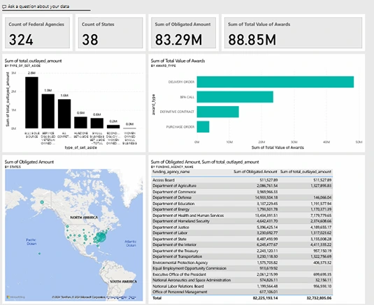
Figure 1 shows an example of a well-designed Power BI dashboard. Each of the items displayed in the dashboard is a separate report. Pinning reports to a dashboard presents a holistic picture. From the dashboard shown in Figure 1, for example, you can ascertain the total amount of spend for Microsoft SharePoint Services across the U.S. Federal Government in Fiscal Year 2023 and Fiscal Year 2024, based on filtered parameters.
Design tips for Power BI dashboards and reports
To create meaningful dashboards and reports in Power BI, you need to be thoughtful about how you design them. Here are some key considerations:
- Choose the right visuals. The Power BI Visualization pane offers 20+ visualization options (see Figure 2). Keep in mind that not all your data should be displayed as a bar, column, line, or pie chart. Think about the story you are trying to tell. Sometimes you want to share a discrete value; other times, you may need a table to boost the level of detail and promote understanding.

- Use filters and slicers. Don’t be afraid to incorporate filters and slicers so that you can drill down into the data. It’s great to see the big picture, but the most effective dashboards allow you to view a subset of data. When creating a dashboard, use filters and slicers to filter all visuals, not just one. Figure 3 shows an example of a slicer that helps narrow down the result set based on a specific classification code called a NAICS.

- Tell a story with your data. Your visualizations, and more importantly the data in the visualization, should tell a concise story. What is the key message you want your audience to learn about from the dashboard? Focusing on discrete metrics can help users focus on the most important insights. In the Dashboard shown in Figure 1, the focus is Fiscal Year 2023 and 2024 SharePoint Service Sales. The visualizations used consider the buyers (agencies and amount spent), contract types the sales were issued under, the geographical distribution of sales during the period, and the total amount spent across several targeted metrics. If you want to drill down into a specific purchasing code to see finer grained details, you can use the slicer to get laser focused.
- Make it accessible. Power BI supports creating reports and dashboards that are Section 508 compliant, ensuring those users who have a visual disability including color blindness can now interpret the data. Consider design elements like color contrast, the use of tooltips, text size, and the use of alt text for images and charts.
Power BI is a versatile and powerful tool for transforming raw data into actionable, interactive insights. If you understand the difference between reports and dashboards and can incorporate the interactive capabilities available from Power BI, your ability to create compelling visualizations will drive informed decision-making.
Which Power App type is right for you?
Power Apps brings together a suite of services, namely low-code application tools and data connectors. It allows users to build applications that capture data, create rich business logic, and display relevant reports in a single location, eliminating the need for multiple tools. With Power Apps, you can develop apps in one of two ways: canvas or model-driven applications.
Canvas and model-driven apps each have distinct purposes and business advantages. The one common factor between both is their reliance on data. Based on your business requirements, it is crucial to determine which type is the best fit. Sometimes, you may need to create a hybrid application — combining the best of both worlds to meet user requirements.
Gathering requirements
When you create an application, you should start by addressing two considerations: (a) the type of data that will be stored and displayed in the app and (b) the business process automation required to meet user needs successfully. When you gather requirements, ask these questions:
- Is there a specific type of data source the application must use?
- Is a custom user experience and user interface (UI) more critical, or is data quality and reliability the priority?
- How often do you intend to make changes to the application?
- What level of reporting is needed, and how should that reporting be presented?
- How comfortable are developers with using custom code to update the user interface?
- Does the application require the creation of custom controls, including Power Apps Component Framework (PCF) controls, to support visualization enhancements, such as buttons, sliders, and check boxes?
- Will the business rely on a complex workflow requiring Power Automate, or can the app utilize business process flows readily available within Power Apps?
Factoring in your use of data
Your use of data is often a key factor in deciding which application format to choose. Ask yourself where the data resides and how complex it is. Canvas apps can pull data from many sources and display those sources in a highly graphical, customizable manner, as shown in Figure 4. Model-driven apps are designed to work with Dataverse, which provides a more rigid method of handling data and user experience, as shown in Figure 5.
Using Dataverse is ideal when complex data modeling requirements, including role-based access security requirements. If Dataverse is required, then you are likely to use model-driven applications. On the other hand, if your application does not rely on Dataverse and interface customization is more important, then Canvas applications are a better fit.
Considering the user interface (UI)
If a custom user interface (UI) is a priority, you’ll want to use a canvas app, as model-driven apps are not flexible when creating a custom look and feel. Model-driven apps provide a consistent, data-rich experience and a user interface familiar to most users, as they mirror the design of many Microsoft applications. On the other hand, canvas apps allow you to create virtually any look and feel you desire. The following table compares the aspects of canvas and model-driven apps to consider before you choose an app type.
Table: Comparing Canvas vs. Model-Driven Apps
Adopting a hybrid approach
Hybrid development is most certainly a possibility. Often, users want the best features from both app types, so selecting the implementation approach isn’t always straightforward. Once you start developing, you can’t simply flip a switch and go between both development modes. You must pick the app format that accommodates your solution's needs.
If you know you’ll need both application development approaches (effectively hybrid), you should develop a model-driven application. Then you can add canvas screens to the model-driven app. A common approach is to use a model-driven app for the primary business process and then use canvas apps for specific tasks that can’t be accomplished with rigid data user experience needs.
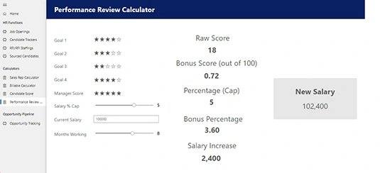
Figure 6 shows a performance management calculator built using canvas app principles, but the application is incorporated into a model-driven app. This example accommodates a variety of user needs, all in one application.
About This Article
This article can be found in the category:


