Decorating a chart with a picture in Office 2019
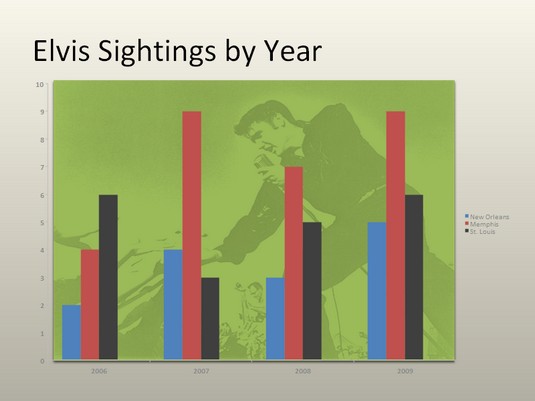
A picture looks mighty nice on the plot area of a chart — especially a column chart. If you have a picture in your computer that would serve well to decorate a chart in Office 2019, you are hereby encouraged to start decorating. Follow these steps to place a picture in the plot area of an Office 2019 chart: Using a picture as the backdrop of a chart.
- Select your chart.
- On the (Chart Tools) Format tab, open the Chart Elements drop-down list and choose Plot Area.
- Click the Format Selection button.
- In the Format Plot Area task pane, click the Picture or Texture Fill option button.
- Click the File button.
You see the Insert Picture dialog box. - Locate the picture you need and select it.
Try to select a light-colored picture that will serve as a background.
- Click the Insert button.
The picture lands in your chart.
Annotating a chart in Office 2019
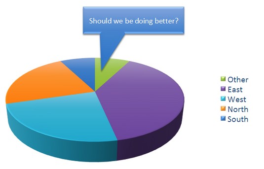
To highlight part of a chart — an especially large pie slice, a tall column, or a bar showing miniscule sales figures — annotate it with a callout text box and place the text box beside the pie slice, column, or bar. The annotation tells you that one sector isn’t performing especially well and somebody ought to get on the ball. Annotations point out a chart’s salient features.
To annotate a chart, select a callout shape, enter text in the callout shape, and connect the shape to part of your chart. Follow these steps to annotate a chart in Office 2019:
- Select your chart and go to the (Chart Tools) Format tab.
- Open the Shapes gallery, scroll to the Callouts section of the drop-down list, and choose a callout.
Depending on the size of your screen, you may have to click the Insert button to get to the Shapes button. - Drag on the page or slide to draw the callout shape.
- Type the annotation inside the callout shape.
After you type the text, you can select it, go to the Home tab, and choose a font and font size for it. - Resize the callout shape as necessary to make it fit with the chart.
- Drag the orange circle on the callout shape to attach the callout to the chart.
You probably have to do some interior decorating to make the callout color fit with the chart.
Displaying the raw data alongside the Office 2019 chart
Showing the worksheet data used to produce a chart is sort of like showing the cops your I.D. It proves you’re the real thing. It makes your chart more authentic. If yours is a simple pie chart or other chart that wasn’t generated with a large amount of raw data, you can display the data alongside your chart in a data table. Anyone who sees the table knows you’re not kidding or fudging the numbers.To place a table with the raw data below your chart, go to the (Chart Tools) Design tab, open the Quick Layout gallery, and select a layout that includes a data table.
To format a data table, go to the (Chart Tools) Format tab, open the Chart Element drop-down list, and choose Data Table. Then click the Format Selection button. You see the Format Data Table task pane, where you can fill the table with color and choose colors for the lines in the table.
Placing a trendline on a chart in Office 2019
Especially on column charts, a trendline can help viewers more clearly see changes in data. Viewers can see, for example, that sales are going up or down, income is rising or falling, or annual rainfall is increasing or decreasing. In this case, the trendline shows that the deer population in Sacramento County is rising. A trendline helps viewers recognize changes in data.
Follow these steps to put a trendline on a chart in Office 2019:
- On the (Chart Tools) Design tab, click the Add Chart Element button.
- Choose Trendline on the drop-down list and select a trendline option on the submenu.
The Add Trendline dialog box appears. - Choose the data series that you want to highlight with a trendline and click OK.
To remove a trendline from a chart, go to the (Chart Tools) Design tab, click the Add Chart Element button, choose Trendline on the drop-down list, and choose None on the submenu.
Troubleshooting a chart in Office 2019
Sometimes tinkering with a chart opens a Pandora’s Box of problems. You find yourself having to correct little errors that appear in charts. Here are some shorthand instructions for fixing common chart problems in Office 2019:- The dates in the chart aren’t formatted right. To change the way in which dates are formatted on a chart, go to the (Chart Tools) Format tab, open the Chart Elements drop-down list, and choose Horizontal (Value) Axis or Vertical (Value) Axis. Then click the Format Selection button, and in the Format Axis task pane, go to the Number category, select Date in the Category menu, and choose a date format.
- The numbers in the chart aren’t formatted right. To change the number of decimal places, include comma separators in numbers, display currency symbols, or do all else that pertains to numbers, go to the (Chart Tools) Format tab, open the Chart Elements drop-down list, and choose Horizontal (Value) Axis or Vertical (Value) Axis. Then click the Format Selection button. You see the Format Axis task pane. Visit the Number category and select options for displaying numbers.
- “Category 1” or “Series 1” appears in the chart legend. To direct you to the right place to enter data in the data grid, phantom names such as “Category 1” and “Series 1” appear in worksheets. Sometimes these phantoms wind up in chart legends as well. To remove them, go to the (Chart Tools) Design tab and click the Edit Data button. You see the data grid, where the data range used to generate the chart is enclosed in a blue box. Drag the lower-right corner of the box so that the box encloses only the data you want for your chart.
- In 3D charts, small markers are obscured by large markers in the foreground. For all the data markers to be shown in a 3D chart, the smaller ones have to be in the foreground. To rearrange data markers, go to the (Chart Tools) Design tab and click the Select Data button to open the Select Data Source dialog box. Then select a series and click the Up or Down button to rearrange the series in your chart. Series that are high on the list go to the back of the chart; series that are low on the list go to the front.
- The chart doesn’t gather all data from the worksheet. On the (Chart Tools) Design tab, click the Edit Data button, and in the data grid that stores data for your chart, enlarge the blue data-range box so that it encloses all your data. You can enlarge the box by dragging its lower-right corner.


