


One way to add a chart to your PowerPoint 2013 presentation is to create a new slide by using a layout that includes a Content placeholder (an object that reserves space for content on the slide). Then click the Chart icon in the Content placeholder to create the chart.
The following procedure shows how to insert a new slide that contains a chart:
Move to the slide that you want the new slide to follow. Click the Home tab and then click the New Slide button in the Slides group.

This action reveals a list of slide layouts.
Click one of the slide layouts that includes a Content placeholder.
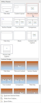
Several slide types include a Content placeholder. When you click the one you want, a slide with the selected layout is added to your presentation. As you can see, the Content placeholder includes six little icons for inserting different types of content.
Click the Chart icon in the middle of the Content placeholder.
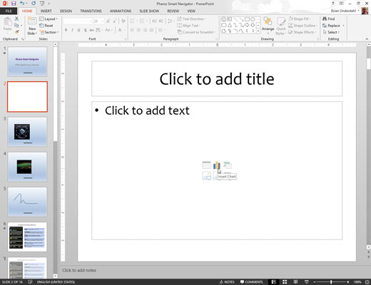
The Chart icon is the one in the middle of the top row of icons. Clicking this icon summons the Insert Chart dialog box.
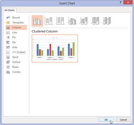
Select the type of chart you want to create.

You can select any of the available chart types.
Click OK.
PowerPoint whirs and grinds for a moment and then inserts the chart into the slide. The reason for all the commotion is that to insert the chart, PowerPoint must find out whether Excel is already running. If not, PowerPoint launches Excel.
Change the sample data to something more realistic.
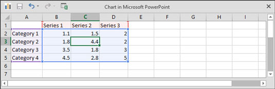
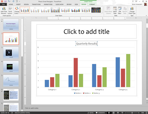
The data for the chart is shown in a separate spreadsheet window that resembles Excel, tiled alongside PowerPoint. You need to edit the data in this spreadsheet to provide the data you want to chart. Notice that any changes you make to the spreadsheet data are automatically reflected in the chart.
Customize the chart any way you want.
For example, you can change the chart layout or style.


