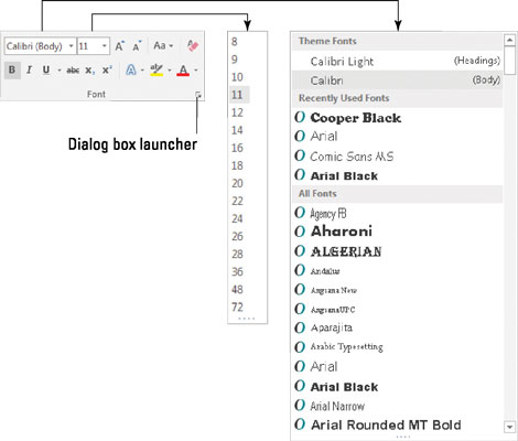
Word 2016 stores the most common text-formatting commands on the Home tab, in the Font group, as shown. The base attribute of text is its typeface, or font. The font sets the way your text looks and its overall style.

Although choosing the best font can be agonizing (and, indeed, many graphic artists are paid well to choose just the right font), the process isn't too difficult. It generally goes like this:
Click the Home tab.
In the Font group, click the down arrow by the Font item.
A list of fonts appears, similar to what's shown on the right in the figure.
Select a font.
As you point the mouse pointer at a font, text in the document changes to preview the font. Click to choose the font and change the text format.
The Font menu is organized to help you locate the font you need. The top part of the menu lists fonts associated with the document theme. The next section contains fonts you've chosen recently, which is handy for reusing fonts. The rest of the list, which can be quite long, shows all fonts available to Word. The fonts appear in alphabetical order and are displayed as they would appear in the document.
To quickly scroll to a specific part of the Font menu, type the first letter of the font you need. For example, type T to find Times New Roman.
If you know the exact font name, you can type it in the Font text box, which seems like a horrifically nerdy thing to do.
When a font name doesn't appear the Font group (the text box is blank), it means that more than one font is selected in the document.
Fonts are the responsibility of Windows, not Word. Thousands of fonts are available for Windows, and they work in all Windows applications.
Graphic designers prefer to use two fonts in a document — one for the text and one for titles. Word is configured this way as well. The Body font is set for text. The Heading font is set for titles. These two fonts are set as part of the document theme.


