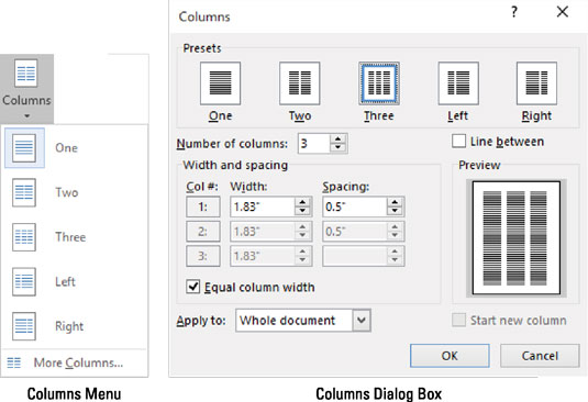
When you desire to impress someone with your text in Word 2016, try putting two columns on your page. Any more columns, and the text width would be too skinny and difficult to read. Two columns, however, is a great way to get fancy and remain legible.
Start up a new document.
Or if you have an existing document, move the toothpick cursor to the document's tippy-top by pressing Ctrl+Home.
Click the Layout tab.
Click the Columns button and choose Two.
You're done.
The entire document flows into two columns. As you type, you'll see text flow down the left side of the page, and then hop up to the top right to start a new column.
To restore the document to one column, repeat the steps here, but in Step 3, choose One.
Columns look best when full justification is applied to all paragraphs. The keyboard shortcut is Ctrl+J.
You can make specific column adjustments in the Width and Spacing area of the Columns dialog box.

If you want an attractive line to appear between the columns of text, visit the Columns dialog box and put a check mark in the Line Between box.
The space between columns is the gutter. Word sets the width of the gutter at 0.5" (half an inch). This amount of white space is pleasing to the eye without being too much of a good thing.


