To control the quality of your project, you should know how to use some charts for the PMP Certification Exam. Many of the tools in this process are easiest to understand when you’re applying them in a fixed, predictable, repetitive environment.
Flow charts
Imagine Karen is your project manager and she discovers some problems with her project. After initial review of satisfaction surveys, Karen determines that the greatest source of dissatisfaction centers around calls to the help desk, so she decides to start her analysis there. The first thing she does is develop a flow chart of the process that the caller goes through when calling the help desk.
Flow charts are a good way to identify where in the process problems could occur.
Karen identifies two areas of concern:
There are no assigned specialists for Internet connectivity issues. If the hardware or software specialists are busy, no one addresses the Internet calls. Not all hardware and software professionals have network expertise in connecting to the Internet.
If the call is not answered in three minutes, callers are asked to leave a message for a callback. Customers do not want a callback; they want their problems solved immediately.

Histograms and Pareto charts
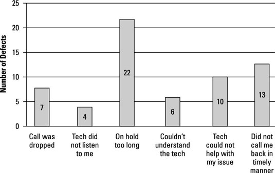
The next thing Karen did was use the information from the IT department survey to rank the reasons for dissatisfaction. She started out by creating a histogram that uses bars to demonstrate the number of times each cause of dissatisfaction was checked.

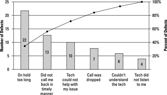
Then she ranked these in order, using a Pareto chart, which is a specific type of histogram ordered by frequency of occurrence that shows how many results each identified cause generates. Notice that the Pareto chart has a line that tracks the cumulative percentage of defects. The left side vertical axis shows the number of defects. The right side vertical axis shows the cumulative percent of defects.

A Pareto chart is sometimes referenced in conjunction with the “80/20 rule,” which states that 80% of the problems come from 20% of the causes.
Based on the histogram, it was clear that Karen needed to address the issue of people being on hold too long, and then look at improving the time for calling people back. If she could improve those two issues, more than one-half of the complaints would be addressed.
Run charts and control charts
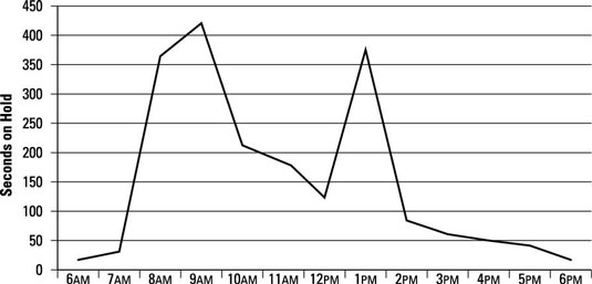
The department metric for answering calls is that a person, not a machine, answers 95% of all calls within three minutes. Karen decided to use a run chart, which charts the history and pattern of variation, to see whether certain times of day had longer average hold times than others.
The ACD system can put out reports for any day that shows the volume of calls and the average hold time. So that Karen didn’t need to look at the data for the last year, she used the principles of statistical sampling to select 20 random days in the past year.
The fluctuation in the sample data shows common-cause variation. In other words, you would expect the average hold time to vary because of the variables in the process. If Karen noted any irregularities, she would look for a special cause, such as someone being out sick, a software upgrade installation, a holiday, or some other unusual event.

When Karen analyzed the data from the run chart, she found that the average hold time was just longer than 2.5 minutes (152 seconds). The longest average hold time was 7 minutes. The range of hold times is from 1 second to 10:43 (10 minutes, 43 seconds). There was a definite spike in the average hold time when people first arrived at work.
Hold time steadily decreased until it spiked when people returned from lunch, and then it steadily declined throughout the afternoon until employees went home.
Karen decided to put the run chart data on a control chart. A control chart is a graphic display of process data over time and against established control limits, and that has a centerline that assists in detecting a trend of plotted values toward either control limit.
Control limit. The area composed of three standard deviations (SD) on either side of the centerline, or mean, of a normal distribution of data plotted on a control chart that reflects the expected variation in the data.
Specification limit. The area, on either side of the centerline, or mean, of data plotted on a control chart that meets the customer’s requirements for a product or service. This area may be greater than or less than the area defined by the control limits.
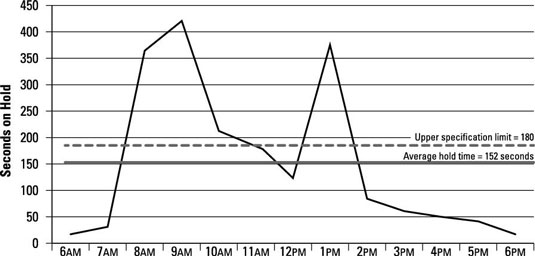
For Karen, showing the control limits didn’t make sense because the process is clearly out of control. Instead, she decided to show the upper specification limit and the average hold time.

From 8 a.m. to 10:59 a.m., the average hold time is greater than the upper specification; from 1 p.m. to 1:59 p.m., hold times are greater than the upper specification, too.
Using the concepts of attribute and variable sampling, Karen can select any period and determine whether the average hold time meets the upper specification limit. She can also use attribute sampling to randomly select a number of calls to see whether each call is within the specification limit. The metric is met or not met. Karen can also perform variable sampling to determine the degree to which a result conforms.
You might hear about the Rule of Seven when talking about control charts. The Rule of Seven states that seven data points trending in one direction (up or down) or seven data points on one side of the mean indicate that the process isn’t random. This means that you should check the measurement to determine whether something is influencing the process.


