The primary Statistical Process Control (SPC) tool for Six Sigma initiatives is the control chart — a graphical tracking of a process input or an output over time. In the control chart, these tracked measurements are visually compared to decision limits calculated from probabilities of the actual process performance.
The visual comparison between the decision limits and the performance data allows you to detect any extraordinary variation in the process — variation that may indicate a problem or fundamental change in the process.
The different types of control charts are separated into two major categories, depending on what type of process measurement you’re tracking: continuous data control charts and attribute data control charts. Here is a list of some of the more common control charts used in each category in Six Sigma:
Continuous data control charts:
Averages and ranges

Averages and standard deviations

Individual values and moving ranges

Attribute data control charts:
p chart
u chart
The control chart you choose is always based first on the type of data you have and then on your control objective. The control chart decision tree aids you in your decision.
The general step-by-step approach for the implementation of a control chart is as follows:
Define what needs to be controlled or monitored.
Determine the measurement system that will supply the data.
Establish the control charts.
Properly collect data.
Make appropriate decisions based on control chart information.

Control charts provide you information about the process measure you’re charting in two ways: the distribution of the process and the trending or change of the process over time. You use control charts to
Provide a simple, common language for discussing the behavior and performance of a process input or output measure
Control the performance of a process by knowing when and when not to take action
Reduce the need for inspection
Understand and predict process capability based on trends and other performance insights
Determine whether changes made to the process are having the desired result
Provide an ongoing, continual view of the performance of the process
Create a repository of data for follow-on improvement activities
Monitor the process
What gets measured gets managed. Deciding what to measure and manage in Six Sigma is determined by your Define, Measure, Analyze, and Improve (DMAI) project activity before you get to the Control phase.
Simply stated, what you monitor with control charts are the critical input Xs and the output CTQs you discover in your project. These are the movers and shakers in your process that align to the needs of your customer. In the control phase, you monitor the outputs — the CTQs — and you control the inputs, the critical Xs. When done properly, this monitoring allows you to benefit from your efforts.
Control charts are two-dimensional graphs plotting the performance of a process on one axis, and time or the sequence of data samples on the other axis. These charts plot a sequence of measured data points from the process. You can also view the sequence of points as a distribution.
Control charts have the following attributes determined by the data itself:
An average or centerline for the data: It’s the sum of all the input data divided by the total number of data points.
An upper control limit (UCL): It’s typically three process standard deviations above the average.
A lower control limit (LCL): It’s typically three process standard deviations below the average.

Understand control limits
You may ask, “What is the significance of a control limit, and where does it come from?” The simplicity of control limits, coupled with their powerful implications, will surprise you. Control charts use probability expressed as control limits to help you determine whether an observed process measure would be expected to occur (in control) or not expected to occur, given normal process variation.
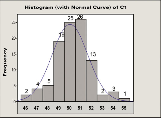
25 data points out of 100 have a value of 50. You then estimate that the probability of getting an event with a value of 50 is 25 out of 100, or 25 percent. Similarly, the probability of getting an event with a value of 52 is approximately 13 percent, and for values of 55 and above, the probability is much lower.
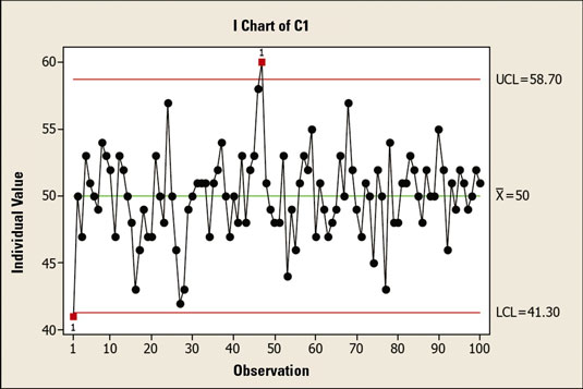
The upper control limit of 58.7 is three standard deviations above the average. The lower control limit of 41.3 is three standard deviations below the average. Plus or minus three standard deviations from the mean includes 99.7 percent of all the data in a normally distributed population.
Therefore, you have a 99.7-percent probability that a process data point will fall between these two limits. That means you have only a 0.3-percent chance that a measurement will be above the UCL or below the LCL.

In the early 20th century, Walter Shewhart, one of the founders of the modern quality movement, formalized the ideas used in control charts. He defined that, if a measurement falls within plus or minus three standard deviations of its average, it is considered “expected” behavior for the process.

If a measurement falls within plus or minus three standard deviations of its average, it’s considered “expected” behavior for the process and thus is a common cause variation. Common cause variation results from the normal operation of a process and is based on the design of the process, process activities, materials, and other process parameters.
However, if a data point falls outside of the control limits, something special has happened to the process. In other words, something out of the ordinary has caused the process to go out of control. This situation is known as special cause variation, meaning that, based on the behavior of the process up to that point, the probability of that situation occurring is less than 0.3 percent.
A measurement with such a low probability suggests that special circumstances affected the process. This simple, quantitative approach by using probability is the essence of all control charts.


