VR design: Giving the user control
A basic tenet of VR is giving users control over their surroundings. In real life, users are fully in control of how they move and perceive the world around them. When users “lose control” in real life is when their movements and perception of the world around them seem to no longer align. This feeling can be equated to the feeling of being inebriated, or what’s commonly referred to as simulator sickness.Simulator sickness should be avoided at all costs — users hate it and it will drive them away from your VR product. You want to ensure your users always feels in control. Their movements should always be mirrored by movement within the virtual environment. Additionally, you should never wrest control away from the user. You don’t want to move the user around without her actions triggering that movement.
Also, don’t rotate or reposition a user’s view of the virtual environment. If a repositioning is needed, it is advisable to fading to black for a moment, then fade back up to your repositioned environment. Although it’s not optimal, fading to black (triggered by a user’s action of course) and back in can be a way to reposition the users environment without your user feeling as if she has relinquished control.Understanding locomotion in VR experiences
Locomotion in VR has yet to be gracefully solved. One of the strengths of VR is the ability to create compelling environments that a user wants to explore. But it doesn’t matter how compelling an environment is if a user can’t move about to explore it.If your experience is more than a static, seated experience, you need to enable users to move about your space. You can create a method for a user to move forward using a standard, non-VR method, such as a joystick, but this kind of motion is apt to produce nausea. It tends to trigger a feeling of acceleration, which in turn triggers simulator sickness.
When adding movement to your VR app, ask yourself how movement is enhancing the user’s VR experience. Unnecessary movement can be disorienting to users. Focusing on what value movement adds to the experience can help strengthen your VR app.
Many applications find ways for users to be grounded on some sort of machine or platform, and then move the platform itself rather than the user. This can help alleviate some of the potential issues of simulator sickness, especially if the user remains seated.For room-scale VR experiences, “teleportation” is one of the current standards for smoothly moving users large distances in virtual worlds. The user aims at the place they would like to move to, some sort of graphic appears to define the target destination, and then the user triggers the teleportation.
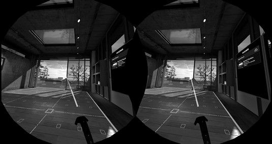
This image shows how a user in Vive’s headset can teleport around the Vive home scene. Holding down the touchpad displays a graphic to the user defining where she’ll teleport to if teleportation is triggered. A user can then choose to trigger the teleportation event, moving her to the new location, or cancel the teleportation event.
 HTC Vive’s home scene teleportation visual.
Locomotion is very much an evolving best practice for VR, and one that is going to require plenty of exploration for what works best for your application. Application developers are implementing and improving upon this mechanic in a number of ways.
Robo Recall, a game for Oculus Rift, enables the user to determine the direction he’ll be facing when he arrives at his teleportation location, instead of just teleporting him straight to the location in whatever direction he’s currently looking. Budget Cuts, a game by publisher Neat Corp, gives the user the ability to peek at his destination and how he’ll be facing before he teleports, removing the confusion that can often occur when a user teleports to a new location.
And teleportation is not the only method of locomotion available. Many applications offer standard “walking” locomotion to users. Smooth locomotion, or sliding through virtual environments without jerky acceleration, can help retain some immersion of a standard method of movement with some of the potential “simulator sickness” triggers minimized.
Other solutions for locomotion within a limited space are also being explored. Saccade-driven redirected walking is a method of redirecting users away from real-world obstacles that allows users to traverse large virtual scenes in a small physical space. In saccade redirection, the virtual scene is rotated slightly in a way invisible to the user, causing the user to alter his walking slightly in response to the digital scene changes. For example, utilizing this method, a user may think he’s walking in a straight line in the digital world, but in the physical world he’s guided on a much more circular path.
Large-scale movement in VR is a mechanic that has yet to be completely solved. Teleportation is often used, but it’s only one of many possible solutions for motion. If your application requires movement, review other applications and their methods of locomotion and see what you think makes sense. You may even be the one to come up with the new standard of motion for VR experiences!
VR design: Providing user feedback
In the real world, a person’s actions are usually met with some sort of feedback, visual or otherwise. Even with your eyes closed, touching a hot stove provides the tactile feedback of a burning sensation. Catch a thrown ball, and you feel the smack of the ball against your palm and the weight of the ball in your hand. Even something as simple as grasping a doorknob or tapping your finger on a computer key provides tactile feedback to your nervous system.VR doesn’t yet have a method for fully realizing tactile feedback, but you can still find ways to provide feedback to the user. If available on the VR device you’re targeting, haptic feedback (via controller vibrations or similar) can help improve the user’s immersive experience. Audio can also help notify the user of actions (when a user clicks a button, for example). Providing these audio and haptic cues alongside your visuals can help make your VR environments seem more immersive and help notify a user when actions have occurred.
Following the user’s gaze in VR design
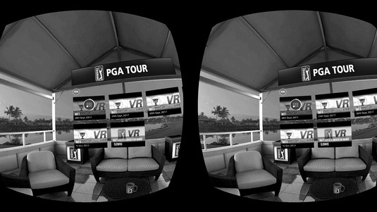
Knowing where a user’s gaze is centered is a necessary part of VR interactions, especially in the current versions of head-mounted displays (HMDs) that don’t provide eye tracking. Many VR applications rely on a user’s gaze for selection. In order to utilize gaze, you may want to provide a visual aid, such as a reticle to help a user target objects. Reticles are typically visually distinct from the rest of the environment in order to stand out, but small and unobtrusive enough to not draw the user’s attention away from the rest of the application. Reticles should trigger some sort of indication to the user as to what elements are interactive within the environment.The image below shows a reticle being used for selection in PGA’s PGA TOUR VR Live application. Without motion controllers, the reticle enables the user to see what interactive item her gaze should be triggering.
 A reticle in use in PGA Tour VR Live.
Depending on your particular VR implementation, you may also choose to display a reticle only when a user is close to objects with which she can interact. This allows a user’s focus to be undisturbed by the extra visual information of a reticle when focused on things that she can’t interact with at the moment.
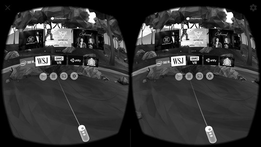
Not every VR application needs a reticle. When using motion controllers to select or interact with objects outside of a user’s reach, a reticle is typically discarded in favor of a laser pointer and cursor for selection. You could just display the cursor, but you’re better off displaying a combination of a virtual model of the controller, a laser ray, and the cursor all together. Doing so helps users notice the motion controller and cursor, helps communicate the angle of the laser ray, and provides real-time feedback and an intuitive feel to the user about how the orientation of the motion controller can affect the input of the ray and cursor.The image below displays a motion controller and laser pointer in use in Google Daydream’s home menu scene.
 A laser pointer in Google Daydream’s home menu scene.
Avoiding simulator sickness in VR design
Simulator sickness is the feeling of nausea brought on by a mismatch between the user’s physical and visual motion cues. At its simplest, your eyes may tell you that you’re moving, but your body disagrees. Nothing will make a user leave your app more quickly than the feeling of simulator sickness.There are a number of ways to avoid simulator sickness.
- Maintain application frame rate. Sixty frames per second (fps) is generally considered the minimum frame rate in which VR applications should run in order to prevent simulator sickness in users. If your app is running at less than 60 fps, you need to find ways to get back to at least 60 fps. Maintaining this frame rate is likely the most important tip to follow, even if it means cutting other portions of your application.
- Maintain continuous head tracking. Head tracking in VR refers to the application continuously following the motion of your head, and having those movements reflect themselves within the virtual environment. Aligning your application’s virtual world positioning with a user’s real-world head movements is vital to avoiding simulator sickness. Even a slight pause while tracking a user’s movements can induce motion sickness.
- Avoid acceleration. In the real world, our bodies notice acceleration far more than we notice movement at a constant velocity. While you’re traveling in a car going 65 mph on a highway, you may not feel any different than if you were sitting on a park bench. However, your body definitely feels the difference of the acceleration from zero to 65 mph.
Acceleration or deceleration in the real world provides a visual change as well as a sensation of motion to the end user. VR, however, provides only a visual update. This lack of sensation of motion in VR can trigger simulator sickness. Avoid accelerating or decelerating a user in VR. If movement within the space is required, try to keep users moving at a constant velocity.
- Avoid fixed-view items. Any graphic that “fixes” itself to the user’s view can trigger the feeling of nausea. In general, keep all objects in 3D while in VR instead of fixing any items to the user’s 2D screen.
More VR best practices to consider
Here are a few more useful best practices for colors, sounds, and text usage, all of which can affect VR user experiences:- Bright colors and environments: Imagine the feeling of leaving a darkened theater and walking out into a bright sunny day. You find yourself shielding your eyes against the glare of the sun, squinting and waiting for your eyes to adjust. In VR, the same feeling can be triggered by quickly changing from any dark scene to a bright scene.
Immediate brightness changes from dark to light can annoy and disorient users, and unlike stepping out into bright sunlight, when in a headset a user has no way of shielding her eyes from the glare. Avoid harsh or quick changes between darker scenes to lighter scenes or items.
Extremely bright colors and scenes can be difficult to look at for an extended period of time and can cause eye fatigue for your users. Be sure to keep scene and item color palettes in mind when building out your experiences.
- Background audio: VR applications should be immersive. In the real world, audio plays a huge part in helping you to determine your environment. From the bustling noises of a busy street to the white noise hum and background noises of an office environment, to the echoing silence of a dark cave, audio cues alone are often enough to describe an environment. Make sure to consider how not only event-based audio (such as audio triggers on user interaction), but also background audio will play a role in your experiences.
- Text input and output: When in VR, users are surrounded with visual information from the environment. Adding large blocks of text to this environment can overload the user with input. Where possible, avoid using large blocks of small-font text. Short text excerpts rendered in large print are typically preferred.
Similarly, it can be difficult for a user in VR to input a large amount of text. Text input in VR has yet to be completely solved. If text input is a requirement of your application, consider carefully how this can occur in the VR space.


