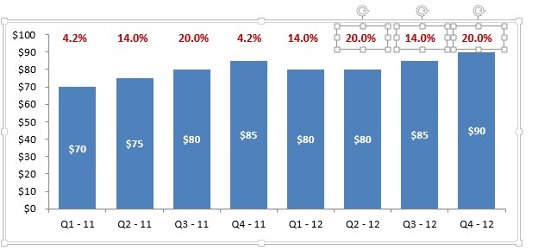
It's not uncommon to be asked to add additional analysis to your visualization that typically isn't plotted on an Excel chart. For example, this chart shows sales for each quarter, but your client may want to also see the percent growth during the same quarters.

Most Excel analysts fulfill this need with actual text boxes. Although this solution works, there is a problem: As the underlying data changes, the text boxes don't reflect the new data. In addition, the text box placement is static. So as the chart columns grow and shrink, the text boxes don't move up or down with the columns.
Instead of using independent text boxes, a better solution is to make the extra layer of analysis part of the visualization itself. In this case, we can incorporate the extra growth percent analysis into the chart. Here's how:
Add a helper series using formulas that essentially adds a few points to the actual data you're charting.
The idea here is to have the helper series be slightly greater than the actual data so that the labels for the helper series end up above the series for the actual data.

Create a new Column chart using both the actual data and the newly created helper series.

Right-click the helper series, select Format Series, and then choose to place the series on a Secondary axis.
Moving the helper series to the secondary axis will allow you to give it its own labels.

Right-click the Secondary Axis labels and select Delete.
You won't want these fake numbers to show up.

Right-click the helper series and choose the Select Data option.
In the Select Data Source dialog box, click the Helper Series entry and then click the Edit button.

Edit the Category Labels input to point to the cells which contain the category labels for your helper series. These are the labels that will actually show up on the chart. In this case, the category labels will be the growth percentages for each respective quarter.

Right-click the helper series and choose Add Data Labels.
Right-click the newly added data labels and select Format Data Labels.
Choose to show only the Category Name as the data labels.

Right-click the helper series and select Format Data Series.
In the Fill options, click No Fill. This will ensure the helper series is invisible.

There you have it. Your extra analysis is now incorporated into the chart. Because the growth percentages are part of the chart (not just text boxes), the growth percentage labels will keep up with changes in the chart. This ensures that the extra analysis will always stay with the data.


