The new Forecast Sheet feature in Excel 2016 makes it super easy to turn a worksheet containing historical financial data into a remarkable visual forecast worksheet. All you do is open the worksheet with your historical data, position the cell cursor in one its cells, and then click the Forecast Sheet button on the Data Tab of the Ribbon (Alt+AFC).
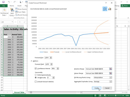
Excel then selects all the historical data in the surrounding worksheet table (which typically includes a column for dates as well as one for the related financial data) while at the same time opening the Create Forecast Worksheet dialog box (similar to the one shown here).

By default, Excel selects a line chart to visually depict the trends in its forecast, but, if you wish, you can have the program use a column chart instead. Simply click the Column Chart icon to the immediate right of the Line Chart icon at the top of the Create Forecast Worksheet dialog box.
In addition to selecting the type of chart to be used in the forecast worksheet, you can also control the date at which the forecast chart ends. You do this by selecting a new date in the Forecast End text box that appears below the preview of the embedded line or column chart. For example, the historical data table includes annual sales for the years 2000 through 2015, and Excel automatically uses this data to extend the forecast end date out four years to 2019. To extend the forecast beyond this end date, simply enter the new year into the Forecast End text box (or select one with the spinner buttons).
Beneath the Forecast End text box in the Create Forecast Worksheet dialog box, you find an Options button that when clicked (as shown) expands the dialog box to include the following options:
Forecast Start enables you to select a starting date in the historical data later than the one Excel automatically selects (which is the first date in the worksheet table).
Confidence Interval allows you to select a new degree confidence that Excel uses to set the Lower- and Upper Confidence Bound line in the forecast when using the default line chart.
Seasonally changes from the Detect Automatically to Set Manually option where you can enter or select a new value indicating the number of points in the values range of your data table that are part of a recurring seasonal pattern. When Excel can't automatically detect seasonality in your worksheet data, a warning appears that so advises you and suggests that you select the Set Manually option button (and leave the default setting at zero) to get better results in the forecast.
Include Forecast Statistics has Excel include a table of forecast accuracy metrics and smoothing factors in the resulting forecast worksheet.
Timeline Range t modifes the cell range containing the date values in your historical data (by default, Excel selects all these values it identifies in the current worksheet table).
Values Range modifies the cell range containing the financial values in your historical data (by default, Excel selects all these values it identifies in the current worksheet table).
Fill Missing Points Using to have Excel automatically fill in any missing data points it finds in the worksheet table in the forecast chart using either interpolation or zeros.
Aggregate Duplicates Using t modifies the statistical function.
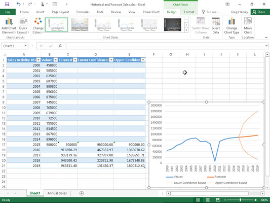
After selecting all the desired options in the Create Forecast Worksheet dialog box, you have only to click the Create button to have Excel create a new forecast worksheet. This new sheet contains a formatted data table that combines your historical data with the forecast values as well as an embedded line or column chart (depending upon your selection) depicting the trend in both the historical and forecast values.
The following figure shows the brand new forecast worksheet that the Excel Forecast Sheet feature created for me using the original historical sales data shown in the preceding figure after selecting the Set Manually option button with the setting at zero and selecting the Include Forecast Statistics check box before clicking Create in the Create Forecast Worksheet dialog box. As you can see, Excel placed this new forecast worksheet (named Sheet 1) before the worksheet containing my historical data (named Annual Sales).

Note that in order to display all the forecast values in the new formatted data table shown, the embedded line chart is repositioned and resized so that it fits nicely in the lower-right corner before taking the screenshot. You could move this chart to its own chart sheet before saving the new forecast table and chart as part of the Historical and Forecast Sales workbook.


