Plotting a logarithmic trend line in Excel
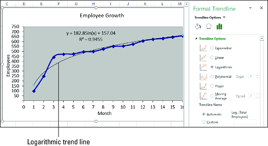
A logarithmic trend is one in which the data rises or falls very quickly at the beginning but then slows down and levels off over time. An example of a logarithmic trend is the sales pattern of a highly anticipated new product, which typically sells in large quantities for a short time and then levels off.To visualize such a trend, you can plot a logarithmic trend line. This is a curved line through the data points where the differences between the points on one side of the line and those on the other side of the line cancel each other out.
Here are the steps to follow to plot a logarithmic trend line in Excel:
- Click the chart to select it.
- If your chart has multiple data series, click the series you want to analyze.
- Choose Design → Add Chart Element → Trendline → More Trendline Options.The Format Trendline pane appears.
- Click the Trendline Options tab.
- Select the Logarithmic radio button.
Excel plots the logarithmic trend line. - (Optional) Select the Display Equation on Chart check box.
If you just want to see the trend line, feel free to pass over Steps 6 and 7. - (Optional) Select the Display R-Squared Value on Chart check box.
- Click Close.
 A chart with a logarithmic trend line.
When the best-fit trend line is a logarithmic curve, the regression equation takes the following general form:
y = m * ln(x) + b
y is the dependent variable; x is the independent variable; b and m are constants; and ln is the natural logarithm, for which you can use the Excel function LN.Excel doesn't have a function that calculates the values of b and m directly. However, you can use the LINEST function if you “straighten out” the logarithmic curve by using a logarithmic scale for the independent values:
{=LINEST(<em>known_ys</em>, LN(<em>known_xs</em>), <em>const</em>, <em>stats</em>)}
Plotting a power trend line in Excel
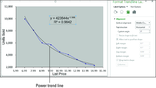
In many cases of regression analysis, the best fit is provided by a power trend, in which the data increases or decreases steadily. Such a trend is clearly not exponential or logarithmic, both of which imply extreme behavior, either at the end of the trend (in the case of exponential) or at the beginning of the trend (in the case of logarithmic). Examples of power trends include revenues, profits, and margins in successful companies, all of which show steady increases in the rate of growth year after year.A power trend sounds linear, but plotting the power trend line shows a curved best-fit line through the data points. In your analysis of such data, it's usually best to try a linear trend line first. If that doesn’t give a good fit, switch to a power trend line.
Follow these steps to plot a power trend line in Excel:
- Click the chart to select it.
- If your chart has multiple data series, click the series you want to analyze.
- Choose Design → Add Chart Element → Trendline → More Trendline Options.
The Format Trendline pane appears. - Click the Trendline Options tab.
- Select the Power radio button.
Excel plots the power trend line. - (Optional) Select the Display Equation on Chart check box.
If you just want to see the trend line, skip Steps 6 and 7. - (Optional) Select the Display R-Squared Value on Chart check box.
- Click Close.
 A chart with a power trend line.
When the best-fit trend line is a power curve, the regression equation takes the following general form:
y = m * x<sup>b</sup>
y is the dependent variable; x is the independent variable; and b and m are constants.There's no worksheet function available to directly calculate the values of b and m. However, you can use the LINEST function if you “straighten out” the power curve by applying a logarithmic scale to the dependent and independent values:
{=LINEST(LN(<em>known_ys</em>), LN(<em>known_xs</em>), <em>const</em>, <em>stats</em>)}
Plotting a polynomial trend line in Excel
In many real-world scenarios, the relationship between the dependent and independent variables doesn't move in a single direction. That would be too easy. For example, rather than constantly rising — uniformly, as in a linear trend, sharply, as in an exponential or logarithmic trend, or steadily, as in a power trend — data such as unit sales, profits, and costs might move up and down.To visualize such a trend, you can plot a polynomial trend line, which is a best-fit line of multiple curves derived using an equation that uses multiple powers of x. The number of powers of x is the order of the polynomial equation. Generally, the higher the order, the tighter the curve fits your existing data, but the more unpredictable your forecasted values are.
If you have a chart already, follow these steps to add a polynomial trend line in Excel:
- Click the chart to select it.
- If your chart has multiple data series, click the series you want to analyze.
- Choose Design → Add Chart Element → Trendline → More Trendline Options.
The Format Trendline pane appears. - Click the Trendline Options tab.
- Select the Polynomial radio button.
- Click the Order spin button arrows to set the order of the polynomial equation you want. Excel plots the polynomial trend line.
- (Optional) Select the Display Equation on Chart check box.
If you just want to see the trend line, bypass Steps 7 and 8. - (Optional) Select the Display R-Squared Value on Chart check box.
- Click Close.
 A chart with a polynomial trend line.
When the best-fit trend line is a polynomial curve, the regression equation takes the following form:
y = mnxn + … + m2x2 + m1x + b
y is the dependent variable; x is the independent variable; and b and m<em>n</em> through m1 are constants.
To calculate the values b and mn through m1, you can use LINEST if you raise the <em>known_xs</em> values to the powers from 1 to n for an nth-order polynomial:
{=LINEST(<em>known_ys</em>, <em>known_xs</em> ^ {1,2,…,<em>n</em>}, <em>const</em>, <em>stats</em>)}
Alternatively, you can use the TREND function:
{=TREND(<em>known_ys</em>, <em>known_xs</em> ^ {1,2,…,<em>n</em>}, <em>new_xs</em>, <em>const</em>)}


